Redesigning the shopping experience for an e-commerce startup
The Inside
The Inside is an e-commerce startup whose mission is to make home decorating fun through customizable furniture. As the sole in-house UX designer, I worked cross-functionally to provide the best shopping experience for customers.
All images are property of The Inside (acquired by Havenly).
Designs shown in this portfolio will likely look a little different from the current live site.
Role
Product Designer
Team
Creative Director (1)
E-commerce Manager (1)
Front-end Developer (1)
Back-end Developer (1)
UX Contractor (1)
Product Designer (me)
Services
IA
UX/UI design
Design systems
User research
Responsive design
Press
ecomm.design
Impact
Conversion rate, after PDP redesign
+172.5%
While the key driver for this conversion rate increase was a 2% conversion rate during a 4-day sale, the conversion rate still exceeded our month-to-date target by 73.8%.
Product Detail Page visits, after CLP redesign
+3%
We found that by prioritizing View PDP, we were able to bring in more users and therefore increase our conversion rates.
Context
Our customers
We found through this data that over half of our users were in their early 40s to late 50s, were likely homeowners, and were all in upper-middle class, dual income households. Many of them were from the South, and lived in homes that had more space for furniture.
Product detail page
As the main driver of revenue, the Product Detail Page redesign provided a huge opportunity to drive up conversion rates among customers. We found that many of our customers were merely exploring when on mobile—a behavior we wanted to encourage, as part of our mission to "create joy in decorating."
Category landing page
The Category Landing Page was another exciting opportunity to get more customers to click into the different products ("View PDP") and ultimately convert. Similar to our objectives for the Product Page, we needed to convey the company's message that decorating is accessible and fun, but not overwhelming.
Challenges
1/ Intuitiveness without overwhelming the user with decision paralysis
The Inside offers a variety of patterns to customize each furniture piece—but that breadth of choice risked overwhelming users. To combat decision paralysis, the website needed to be intuitive and seamless, allowing users to easily explore the brand’s full customization offerings.
2/ Design consistency
When I joined The Inside, brand guidelines existed for marketing materials, but there was no design system in place for the website. The site lacked visual consistency, clear UX patterns, and standardization of basic components like buttons, making alignment challenging between the development and design teams.
3/ Responsiveness
Although research showed most customers completed purchases on desktop, a significant amount of traffic still came from mobile devices. We hypothesized that users were exploring products on mobile before switching to desktop to complete their purchase. However, the mobile experience was clunky and inaccessible, so we needed to optimize it and ensure consistency with the desktop experience to support a seamless cross-device journey.
Process
I collaborated with a short-term UX contractor who led the overall design and flow, conducted the competitor analysis, and aligned with company executives. I focused on refining the UI to ensure consistency with brand guidelines, worked closely with developers to launch the designs, and continued iterating on and enhancing the designs post-launch.
Features
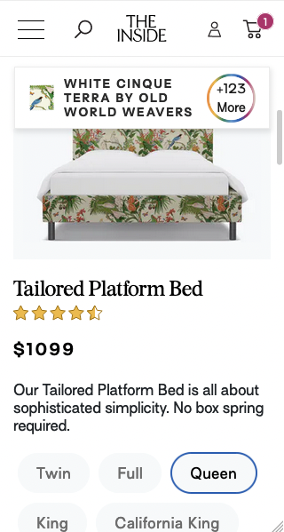
Product detail page (PDP)
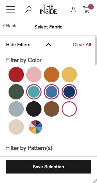
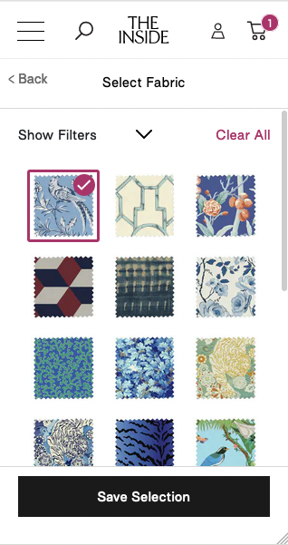
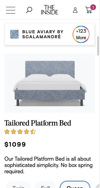
We restructured the page elements so that the variety of customization options was quickly accessible, yet not overwhelming. The new Fabric Customizer sorts over 120 different fabrics, and users can now easily click through different options and watch the product change live.
To foster a delightful furniture shopping experience, especially for our mobile customers, we made sure that the customizing UX was consistent and easy to use on both mobile and desktop.
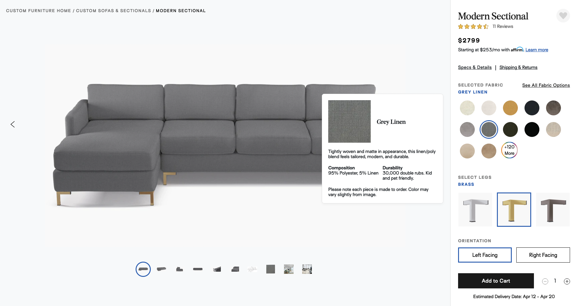
Hovering over a fabric reveals additional details
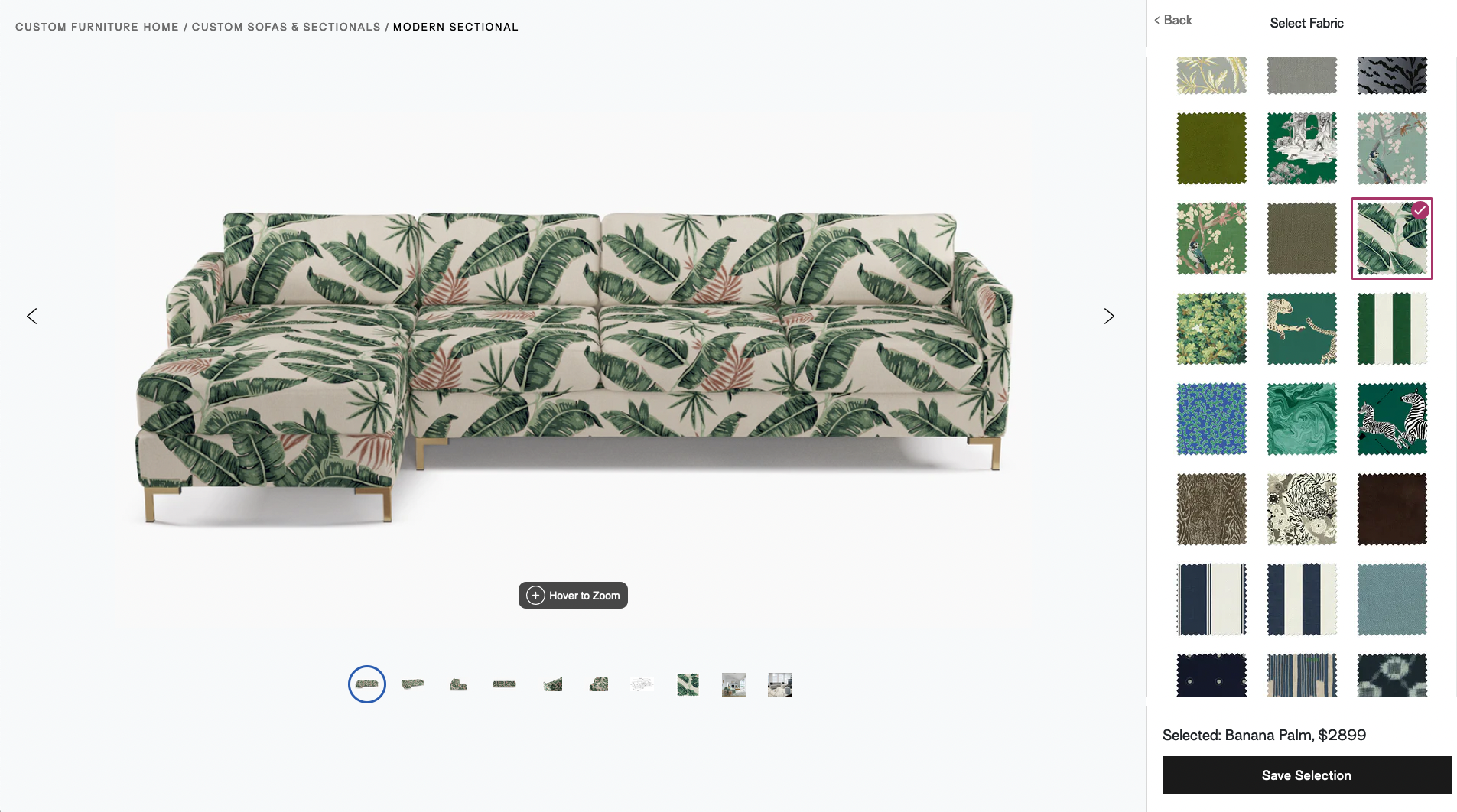
Clicking through the Fabric Customizer on the PDP updates the fabric on the Modern Sectional in real time
Category landing page (CLP)
We created a Swatch Filter Bar fixed to the top of the pages, so that customers could sort and click through the different fabric options. Like in the PDP, the products would change live, for a more interactive and delightful purchasing experience. The product frames were laid out such that users could easily compare and decide which product they preferred.
As we found that many of our customers were in the exploratory phase on the category page, we reused some components from our new PDP's Fabric Customizer so that users could have a seamless experience on both mobile and desktop.
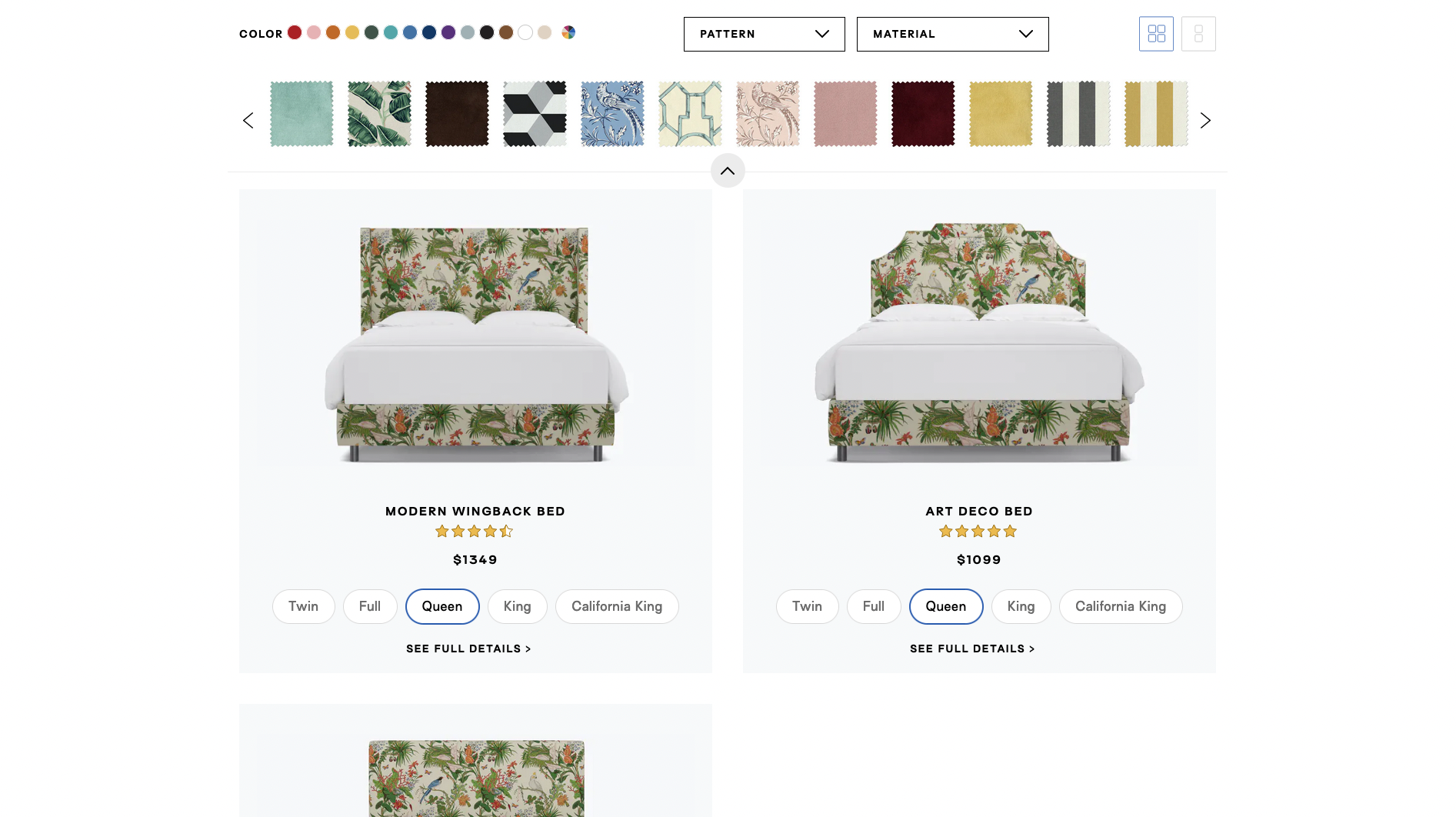
Desktop view shows the category landing page with the Swatch Filter bar, which allows users preview patterns in real time
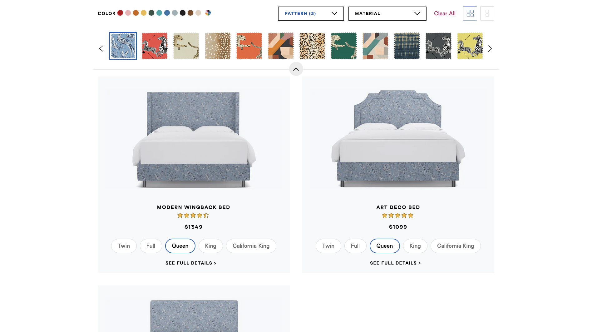
Clicking through the fabric options changes the SKUs in real time for easier comparison
On mobile, users are encouraged to exploring the fabric offerings via the Fabric Customizer design that is also used on the PDP
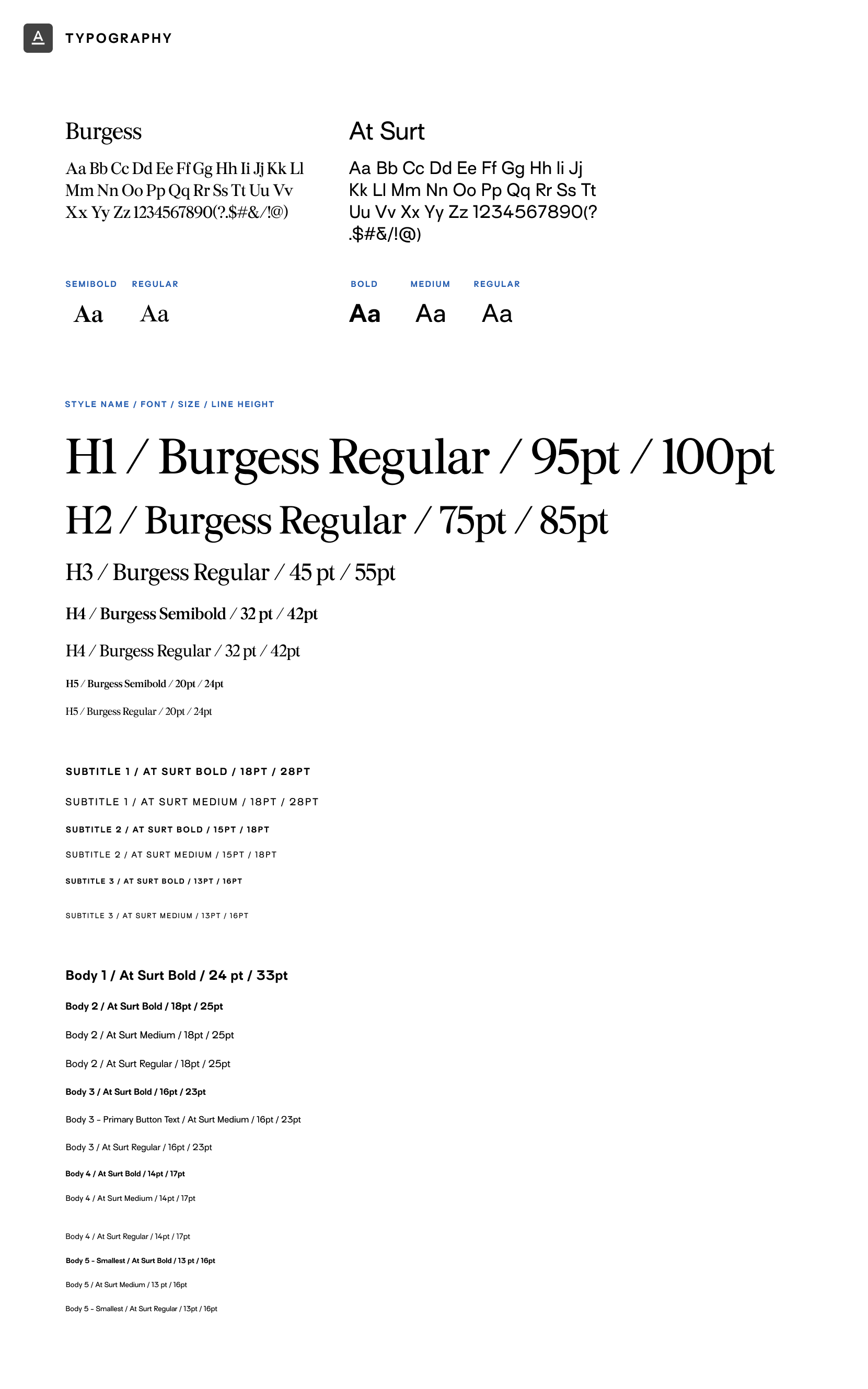
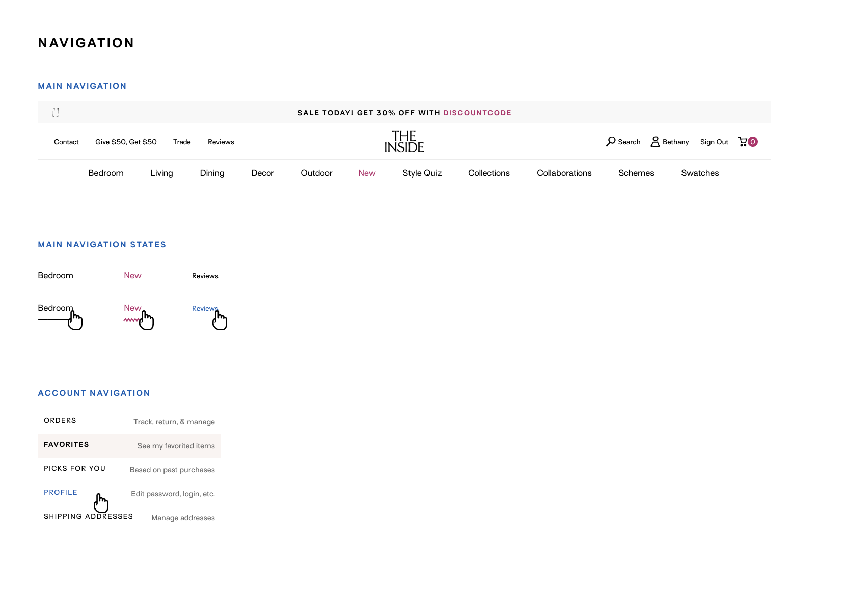
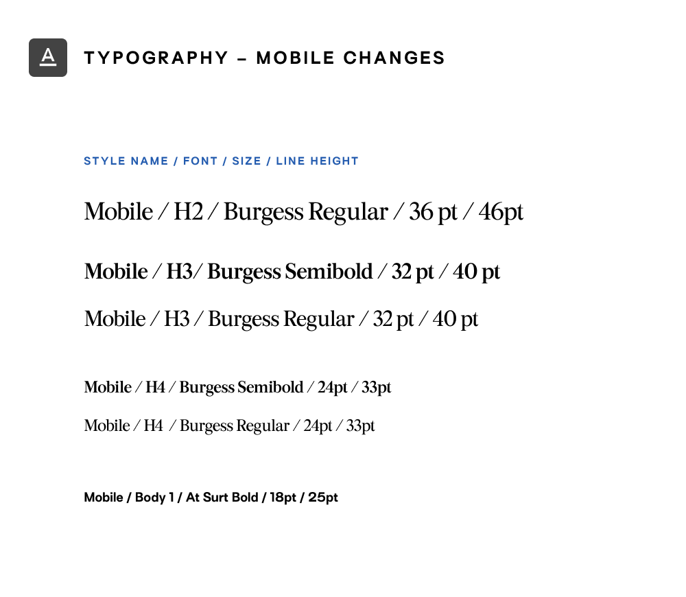
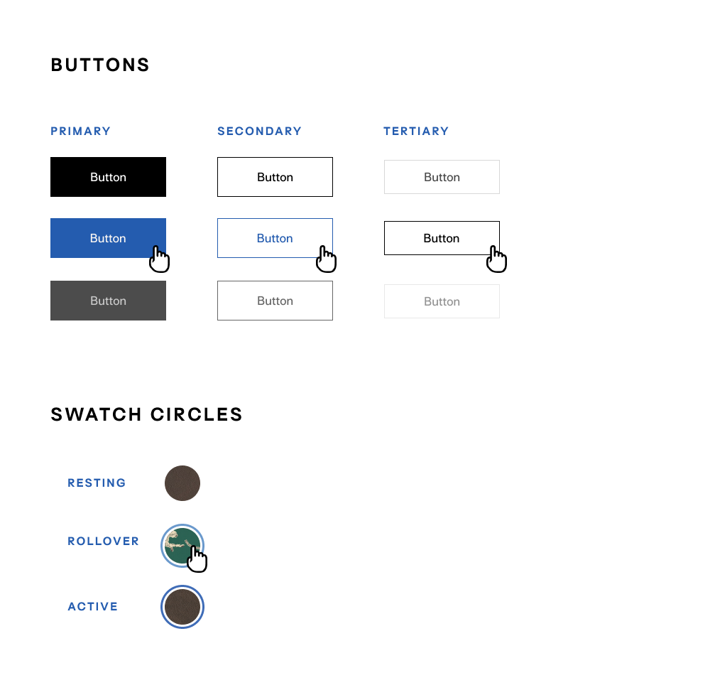
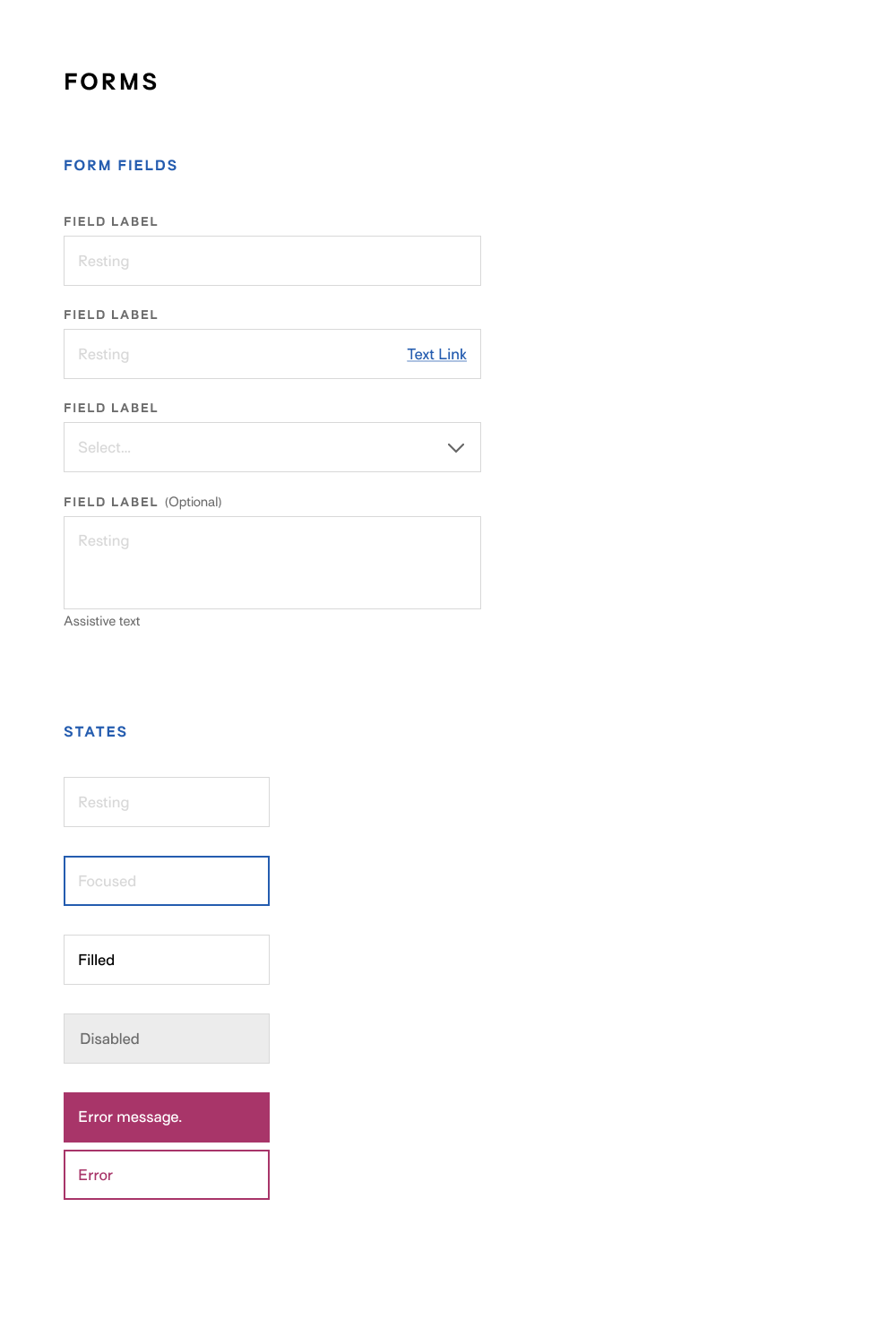
Design system
Using the company’s brand guidelines, I built a responsive design system in Figma, with a component library to streamline hi-fidelity wireframes and provide developers with standardized styles and variations.
Only part of the design system is shown.
Desktop view shows the category landing page with the Swatch Filter bar, which allows users preview patterns in real time
Results & learnings
While the PDP and CLP redesigns successfully increased PDP visits and conversion rate, even exceeding the business's target, there were some refinements that could push the redesign further:
- While the marketing brand guidelines were a helpful foundation for the design system, the color palette needed reassessment to meet accessibility standards for color contrast.
- More precise metric tracking would have helped identify which redesign elements drove conversion. Launching the redesign alongside a major 4-day sale skewed results, making it harder to isolate its impact.
See more work

A converged knowledge base for a telecom appUX/UI, design system, WCAG
Mobile app design for guided pain managementResearch, UX/UI, design system
A list-making mobile app for language-learnersUX, research
Website design for booking hostelsUI, design system

A Year of SoloPhotography, writing, book design

Self: A Portrait Through FilmData visualization
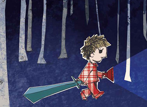
The JabberwockyIllustration
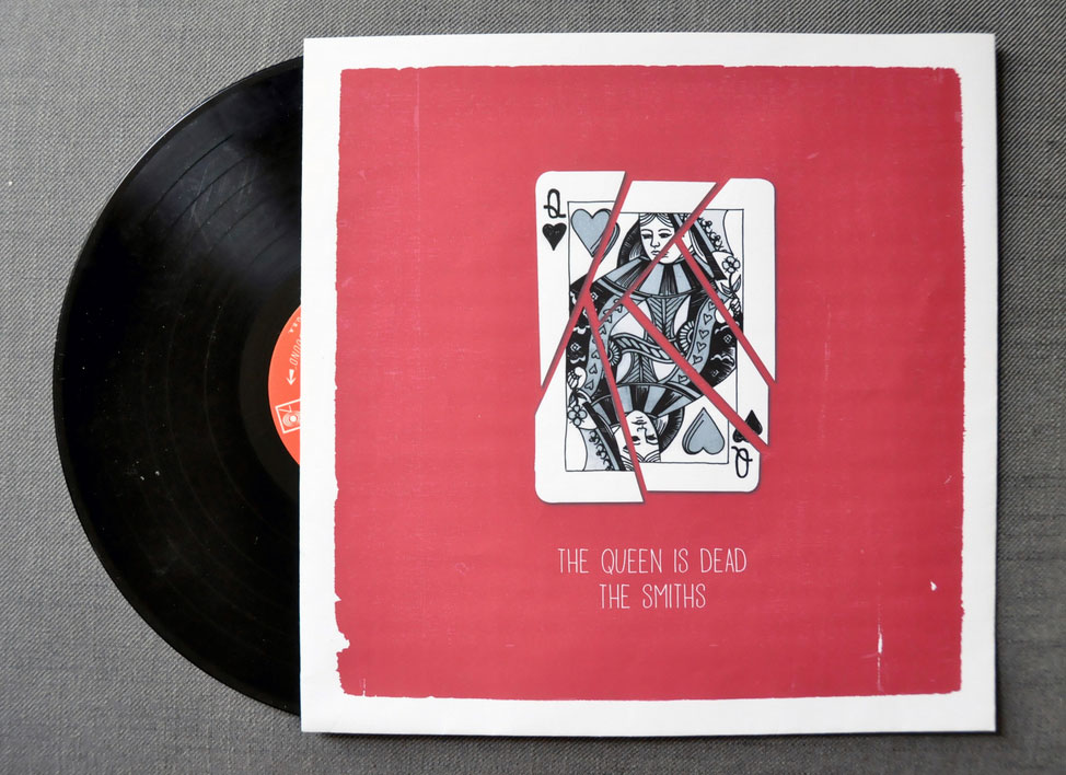
The Queen is DeadIllustration

A Food Blogger's Year in ReviewData visualization

MoistGraphic design
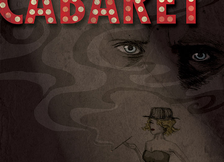
CabaretIllustration, graphic design