A converged knowledge base for telecommunications agents
Comcast Xfinity: Celestial
Celestial is a new telecommunications application that will combine Comcast Xfinity's current 6+ agent-facing tools into one responsive, role-customized, and accessible workspace. Ultimately with this new tool, the goal is to deliver a greatly improved, personal sales and service for Comcast customers. As a UX designer, I worked in several 'pods' (teams) that focused on different problems for this future application:
Knowledge/Home (7 months): The first space to launch within the app, Knowledge/Home is the knowledge base for Comcast agents.
Collections & Payments (1 year): This set of features allows customers to pay for their bills with different options such as installment plans. (Please contact me for more information about my work on this pod.)
All images are property of Comcast Xfinity.
Role
Product Designer
Services
IA
UX/UI design
Design systems
Responsive design
WCAG compliance
Knowledge/Home team
Product Owner (1)
Design Lead (1)
Solution Architect (1)
Content Strategist (1)
Product Designers (1+me)
Collection & Payments team
Product Owner (1)
Design Lead (1)
Solution Architect (1)
Product Designer (me)
Impact
# of frontline employees impacted upon launch
30,000
Celestial Knowledge entirely replaced the previous knowledge base tool across the enterprise, affecting residential employees in Sales, Retail, and Customer Experience.
User adoption percentage
200%
The number of users that accessed Celestial in the first month exceeded the business goal by 2.8x.
Average feedback score
3.8/5
The average score of Celestial's in-tool pulse survey met the business's goal of 3+, taken by 112 users in the first week of launch.
User feedback after Celestial Knowledge launch
"I would be more likely to use Celestial in the future than I was to use [previous tool] in the past."
"My criticisms turned into escalations, and my escalations turned into the corrected usage of the Celestial Knowledge tool. Overall, PASS with A++++ information, layout, usability, user interface. This is the best tool we have had on this level."
"General navigation—it's wonderful. Things load quickly, it's easy to navigate."
"The data content and layout is superb."
Kind words from the client
"Sohee, you make it look so simple. I know simple is the hardest part of UX. Thank you!"
Kind words from my team
"Sohee is one of the most talented and thoughtful designers I’ve had the pleasure to work with. She has played a massively instrumental role in designing the Home Knowledge component & template library, which if you don’t know what that is, let me tell you, it is vast and ever-changing. Even with such a large complex body of work to manage (for a period of time by herself), Sohee did so, and did it well. Always producing high quality work, thoughtful decision-making, and ensuring to collaborate with other Celestial design partners to ensure the work was cohesive across the design system. But more important than all of that, is simply Sohee the person, she’s one of the most pleasant people I get to share my work week with, always bringing a positive attitude, an honest perspective, and a good natured approach to people."
Process
Discovery
Before Celestial, Comcast's frontline employees were using multiple applications daily, which caused problems with increased swivel, redundant content, and operational and process efficiency. Tool teams also had problems with efficiency, with slow time to market, difficulty with maintaining the multiple tools and platforms, and governance and processes that were not streamlined.
With Celestial Knowledge as the first space to be launched within Celestial, the research team conducted research sessions with over 1,900 frontline employees. This included surveys, focus groups, unmoderated prototype testing, and card sorts. Collaboration and qualitative feedback sessions were also conducted with key leadership stakeholders.
Key themes identified
1/ Improved search, navigation, and personalization*
Users were struggling with finding what they needed—which was due to confusing navigation, ineffective search functionality, or merely trying to sift through large amounts of irrelevant information. In fact, 84% of frontline agents wanted a role-based, personalized view of information.
2/ Improved ability to bookmark useful links, resources, and applications
Because of the difficulty in finding relevant information, users would find hacky workarounds to perform at their jobs effectively, such as adding browser bookmarks.
3/ Sharing content among coworkers
Another hacky workaround included printing out pages or trying to find ways to email content such as knowledge articles to their coworkers or customers.
4/ Too much redundancy
Users did not have a single place to go for information—they would visit at least two different tools for product education, and often there was inconsistent information.
*For this case study, we will focus only on this first key theme.
Quotes from initial user research
"The search feature isn't very good. You search for something simple; you get every article in the last year that even mentioned the word in your search. I mostly just use the search function as a shortcut to pull up apps." - Retail agent from Northeast Division
"The overall design could be easier to navigate." - Representative from West Division
"Make it customizable by the rep so we don't have to filter through things that are not relevant to us." - Northeast Divison
"Customization would be fantastic—sometimes it's hard to find pages on [previous tool] so I end up just adding browser bookmarks, but it'd be nice to have a way to cultivate our favorites and frequently visited pages to make accessing them more efficient." - Care agent from Northeast Division
Information architecture & content strategy
The inconsistencies in information, design patterns, and visual layouts increased cognitive load for users as they tried to digest content and find the information they needed. Our team's content strategist did a content audit of the most representative pages of the main knowledge base tools used and created a more digestible content model that would be much more useful for customers to easily orient themselves. We also identified key content types that were consistently used and needed across all tools, so that we could incorporate those in our new, more templatized (yet flexible) page layouts, as well as for the navigation and a more useful search.
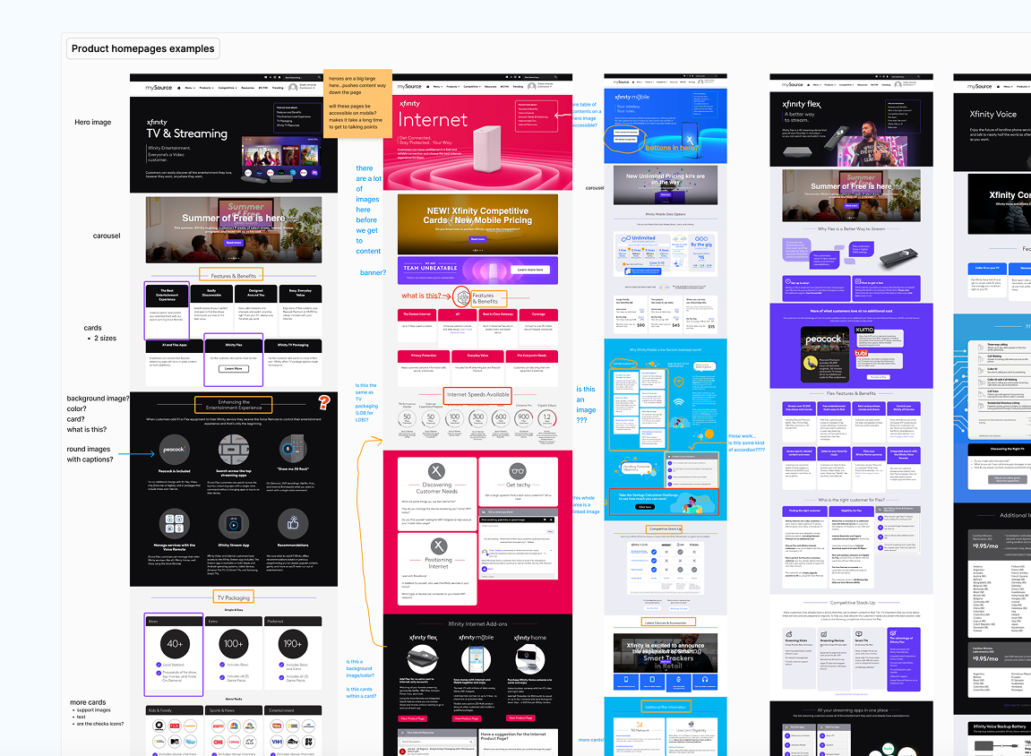
Audit of representative product pages
Category navigation research
Page mapping to rethink how to organize the existing content in a digestible way
Draft of new homepage content model
Features
Component library & page templates
As a key owner of the Home/Knowledge UI, I leveraged Xfinity's new design system, which was more customer-facing, to build a more agent-facing component library. At the time, the enterprise UI kit of the design system was still new, with the design system team still forming its Enterprise subdivision, so with my design lead, we built many of the new component variants for a more agent-facing tool. We riffed on atomic design and added another layer called "compositions," which were more like larger, templatized sections of components that made up a page.
The component library for Celestial Knowledge consisted mostly of these compositions and composition types, as well as entire page templates that our content strategist identified with her content modeling.
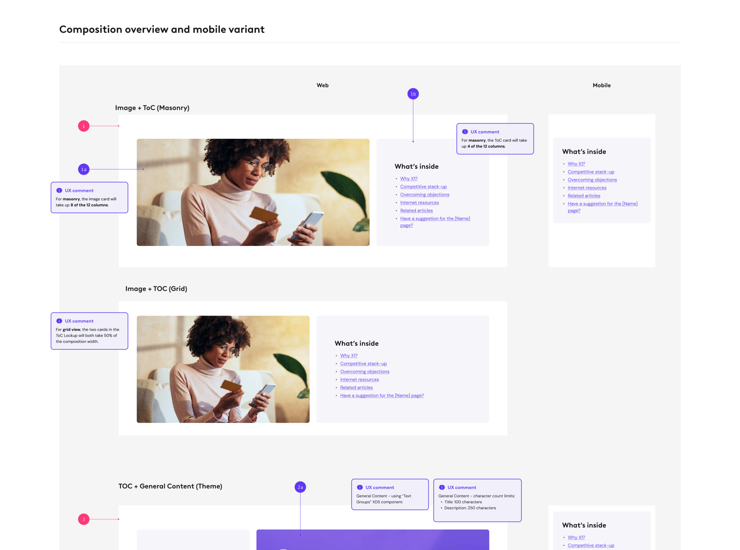
Documentation of composition types
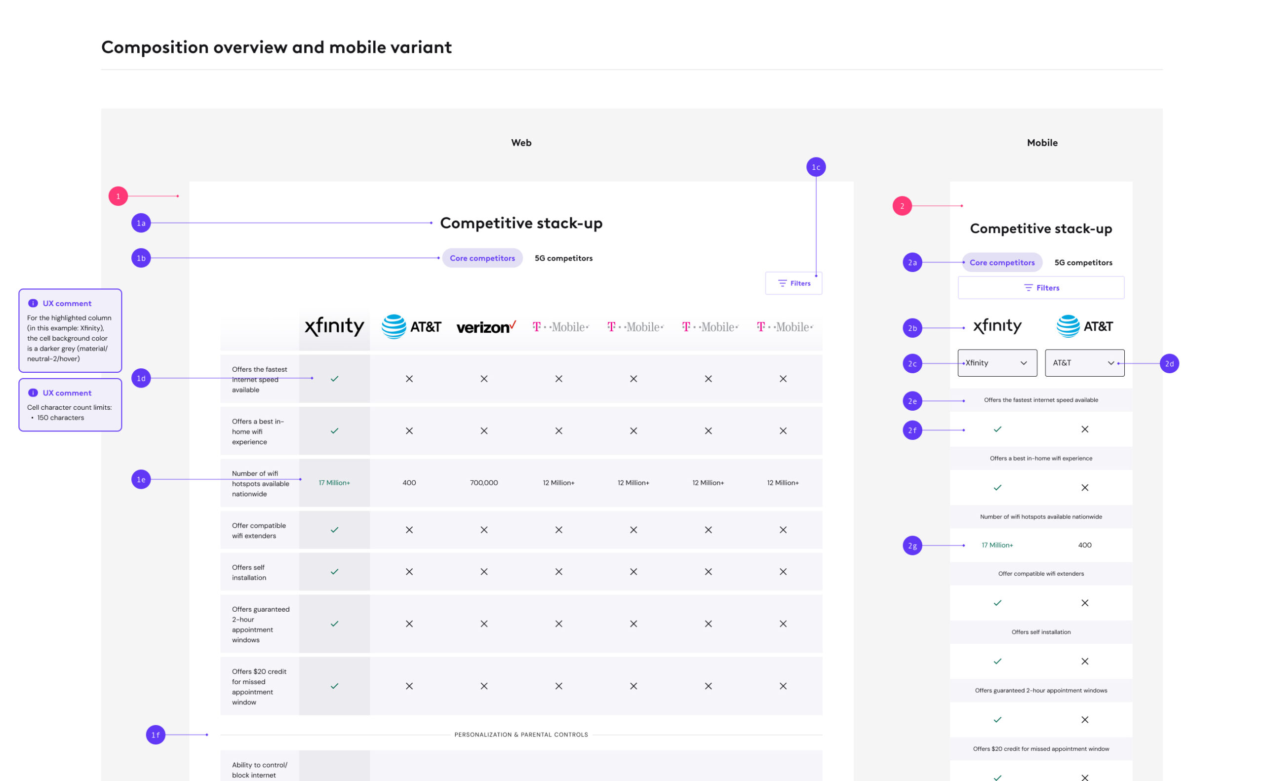
Documentation of a composition
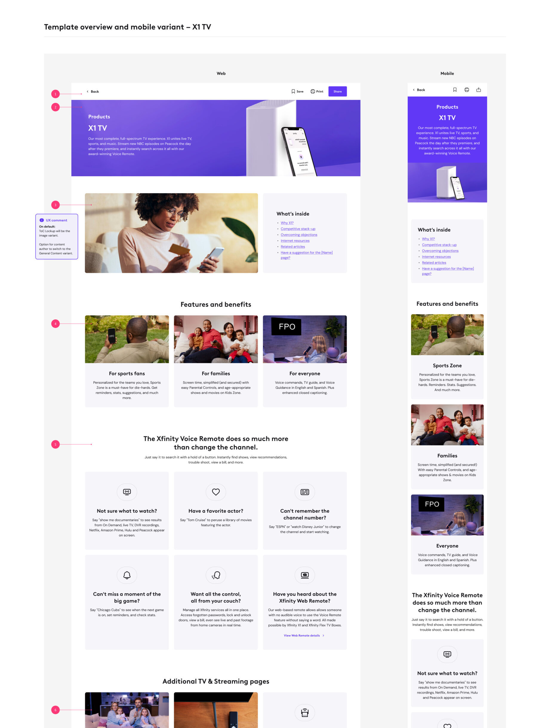
Documentation of a product page template
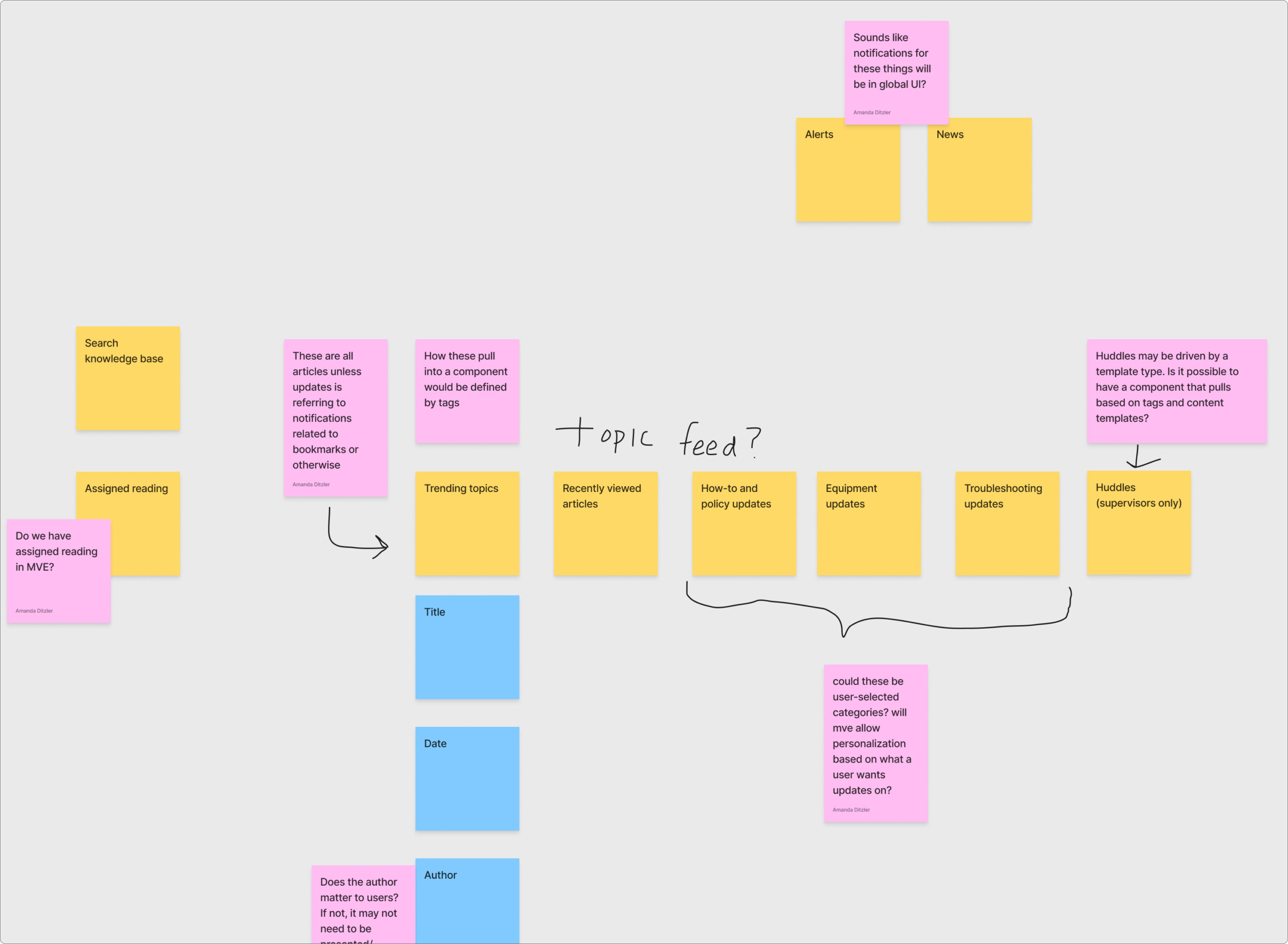
Search functionality
I designed and documented a more detailed search functionality for Celestial Knowledge that took into account the pain points that users had about the previous tool's search. Our content strategist provided some search suggestions based on the most searched items, and we included a section of the typeahead menu to include recent searches and search suggestions based on the most widely searched items, as well as the client's featured information.
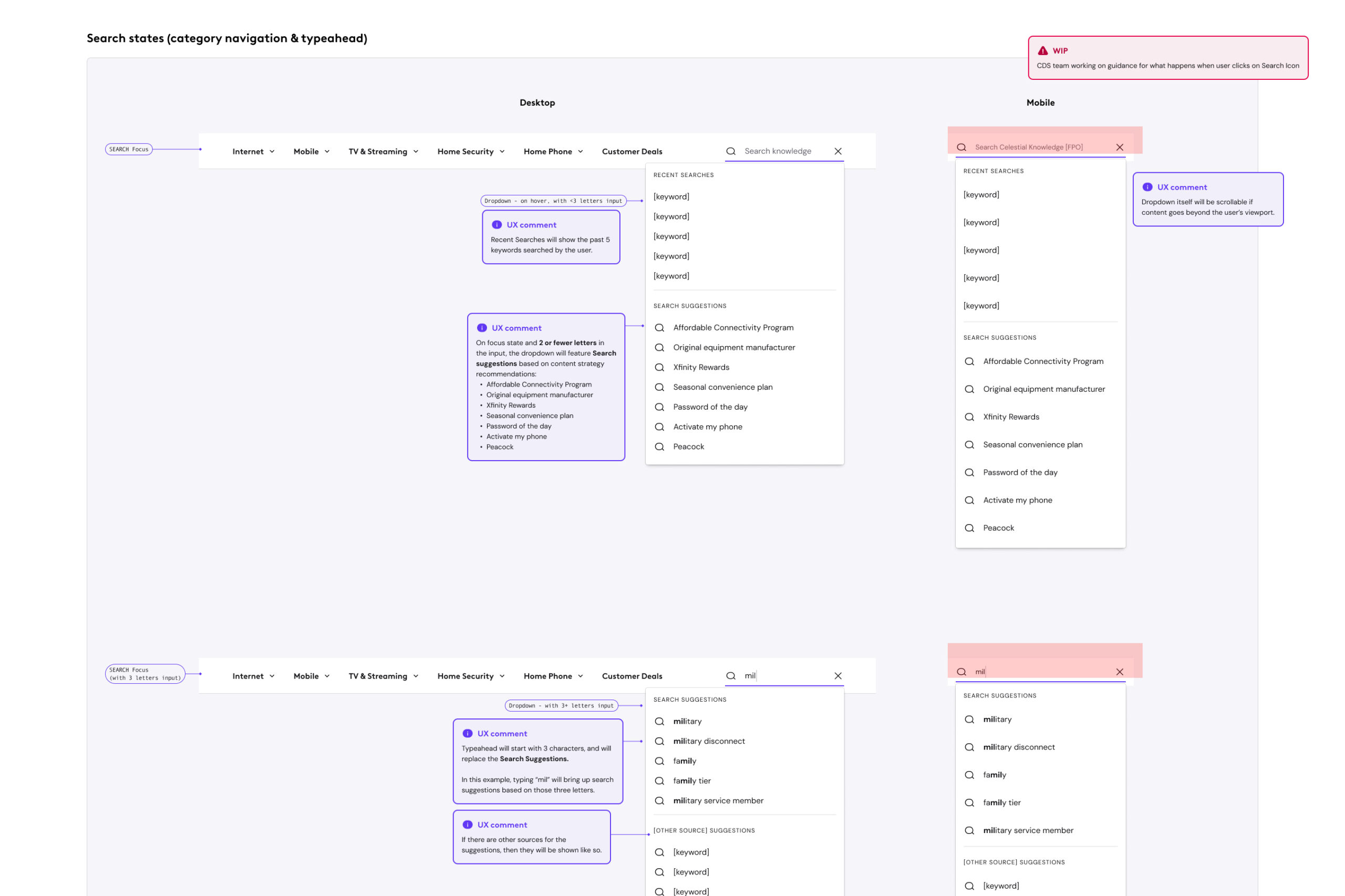
Documentation of the search bar functionality and typeahead
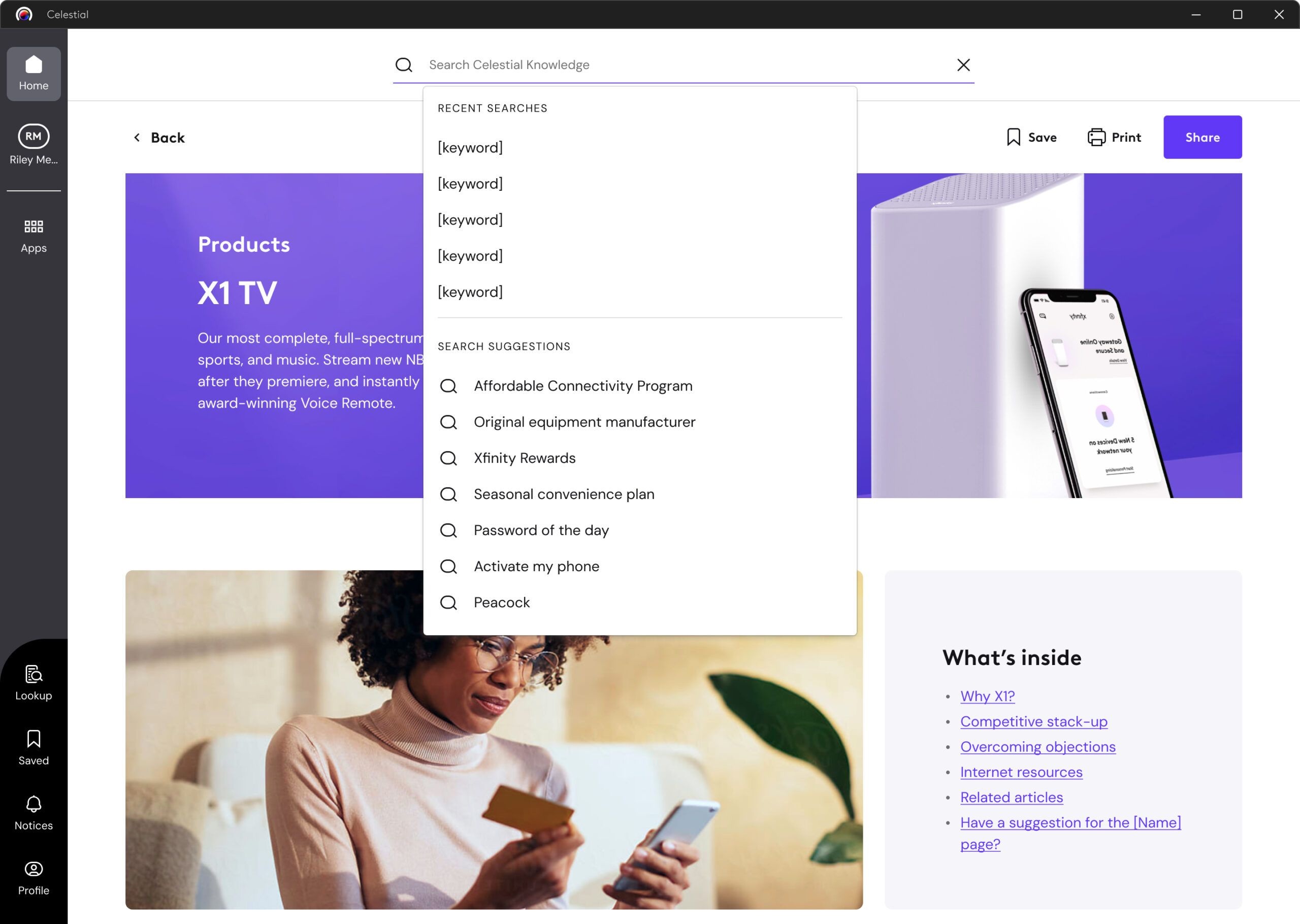
Search functionality in context with the product page
Future iterations of this search functionality incorporated AI, training the LLM with knowledge articles and other resources. That way, agents did not have to use precise language when searching, and were provided the tools and articles they needed much more quickly and efficiently.
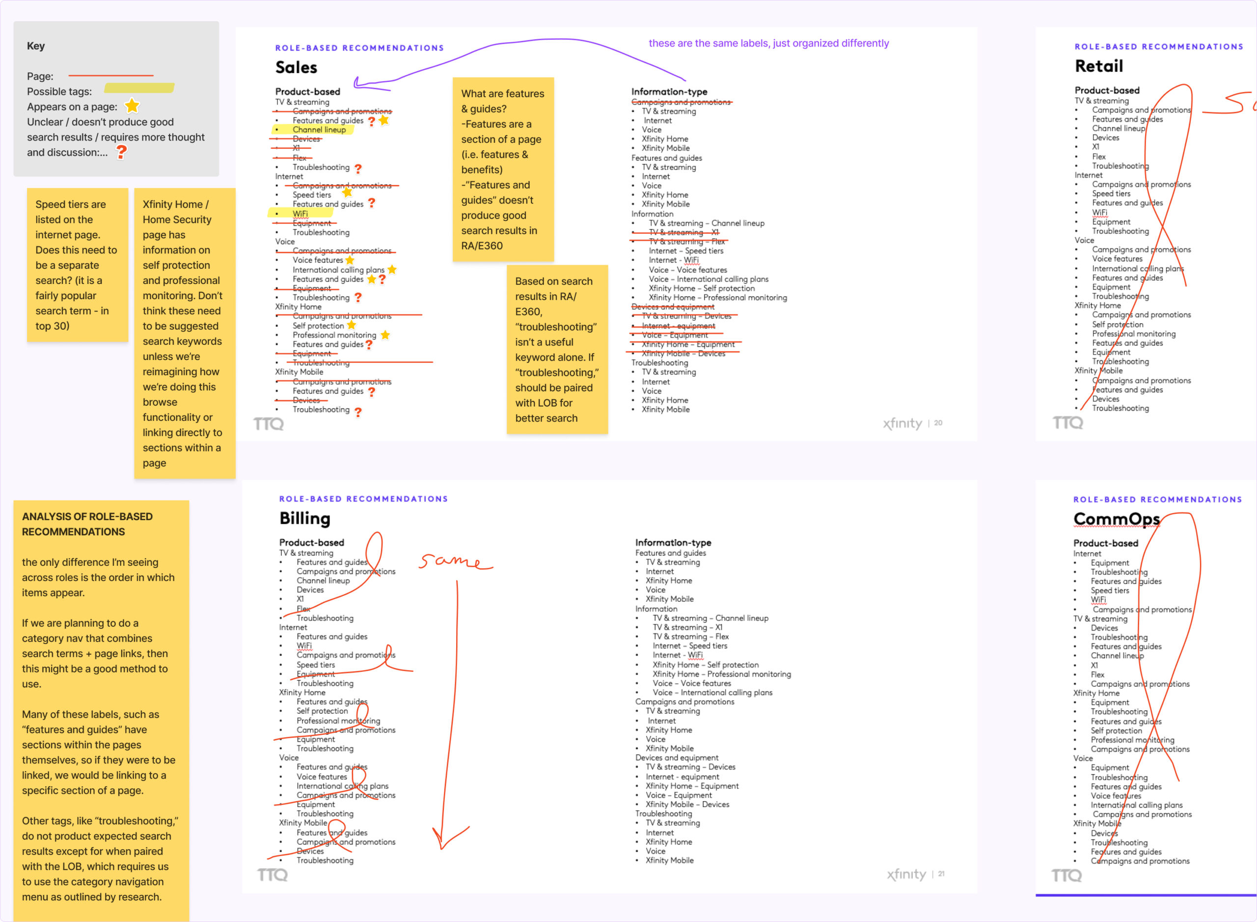
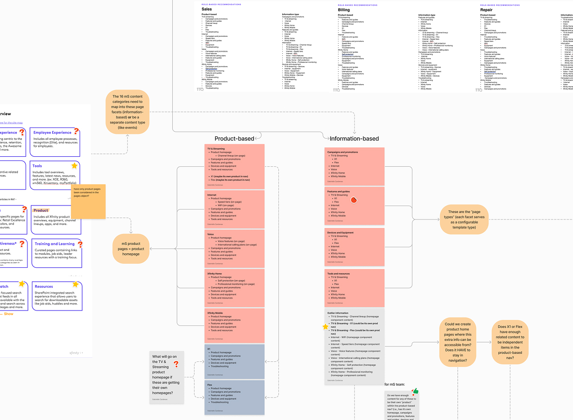
Category navigation
Collaborating with our content strategist, I designed and documented the new navigation for the Knowledge space of Celestial, which was centered around a much more organized mental model so that the agents could easily find the page or article they were looking for. From the thorough content audit earlier in our process, every knowledge article and document had its place in Celestial Knowledge, and we worked with Comcast's governance and content teams to ensure that their processes maintained this model for any future content.
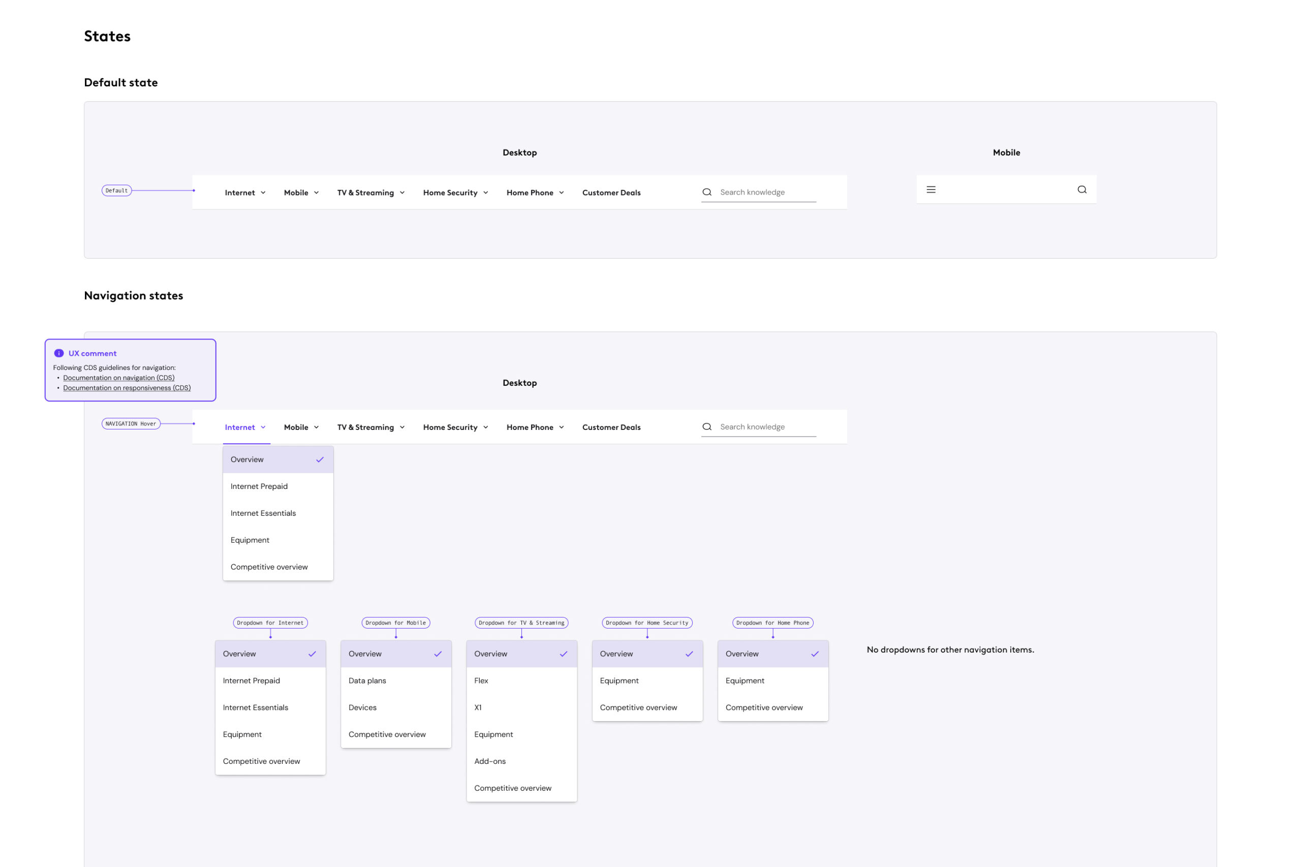
Documentation of the Celestial navigation
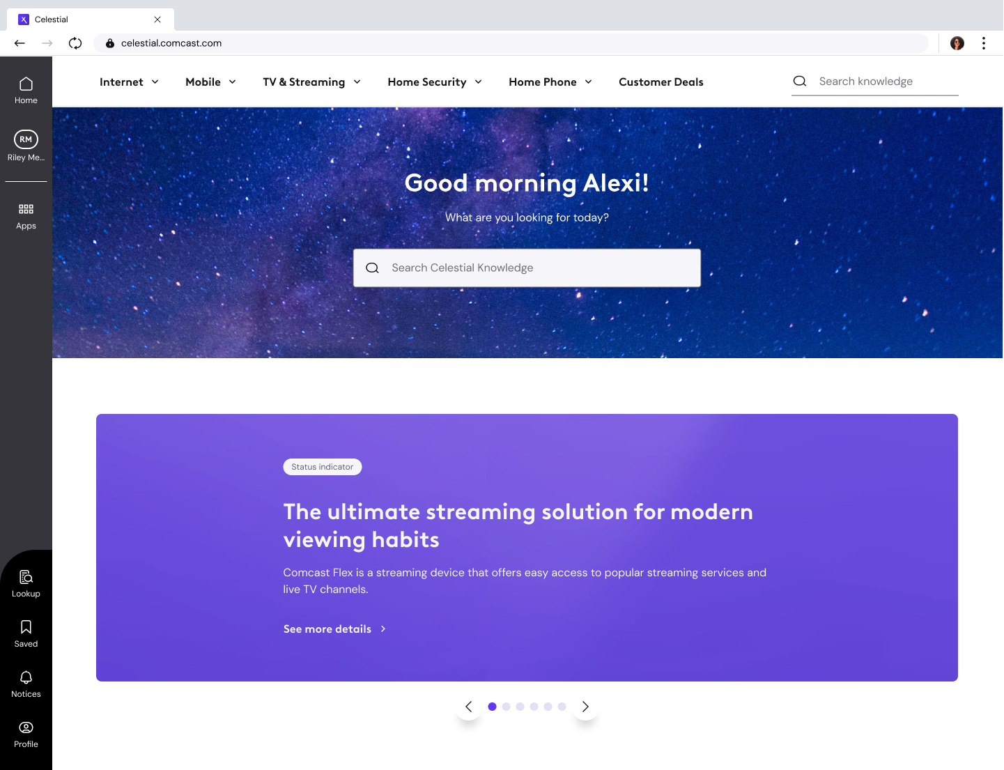
Top navigation bar in context with the homepage MVP (owned by my co-UX designer)
Results
We delivered the MVP of the Celestial Knowledge space in time for the soft launch, then the hard launch to replace the previous knowledge base tool for 30,000 frontline agents. Comcast's research teams were gathering feedback throughout the process for future iterations on both Celestial Knowledge's usability and the new training processes for Celestial.
- The content modelling ensured that the storage of knowledge articles and pages was intuitive and consistent so that users would be able to quickly learn and understand how to use the tool.
- The component library and page templates brought a consistent UI and experience across the entire Knowledge space to lessen the cognitive load for users, as well as keep the naming conventions consistent across the various divisions of Comcast.
- The new search functionality prioritized more recent and popularly searched articles, reducing the need for users to sift through outdated content. However, as part of Comcast’s shift toward AI-driven solutions, the team transitioned to using a trained LLM to power the search experience (I was not part of the team at this time).
- The category navigation gave a more consistent and intuitive experience for users, and also leaned on the consistent naming that was agreed upon across the various teams at Comcast.
See more work
Redesigning the shopping experience for an e-commerce startupUX/UI, design system
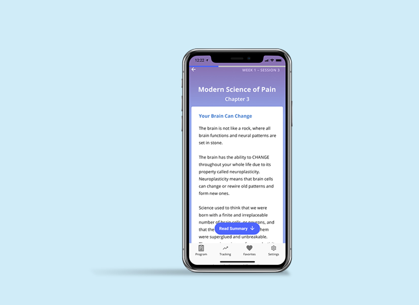
Mobile app design for guided pain managementResearch, UX/UI, design system
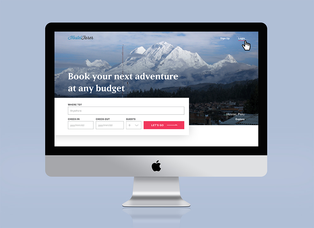
Website design for booking hostelsUI, design system

A Year of SoloPhotography, writing, book design

Self: A Portrait Through FilmData visualization

The JabberwockyIllustration
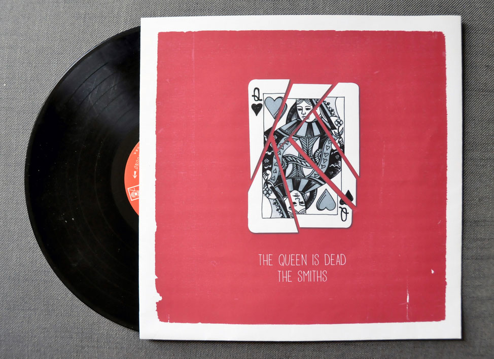
The Queen is DeadIllustration

A Food Blogger's Year in ReviewData visualization

MoistGraphic design
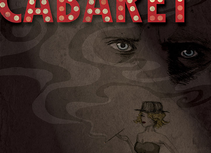
CabaretIllustration, graphic design
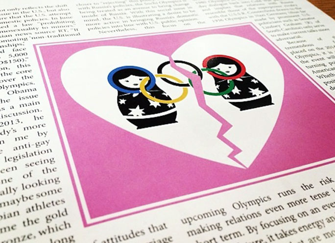
Penn Political ReviewIllustration