LinguaList
UX Researcher & Designer (Sketch)
Created for "UX Research & Strategy" (Designlab course)
4 weeks
LinguaList is a mobile app concept that was created from my own fascination with language learning post-schooling. Once any language requirements are out of the story, what motivates people to learn a new language, and what keeps them going? What makes them stop?
Using user research, I pinpointed needs and frustrations from language learners and concepted a possible solution in app form.
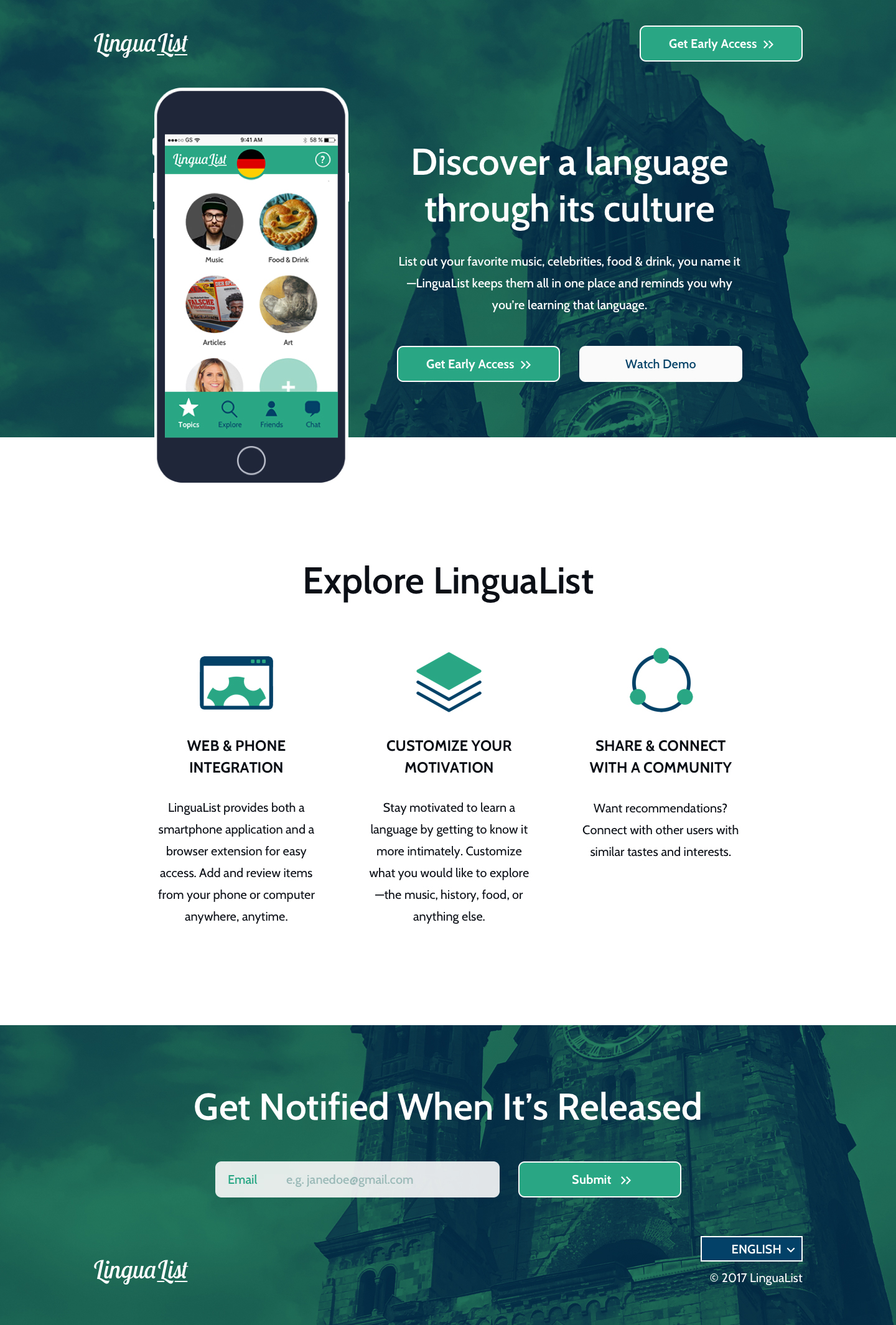
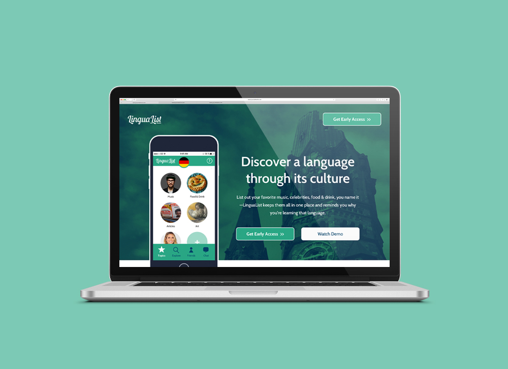
APP CONCEPT | LinguaList serves both as a list-making tool and a social platform for language learners. Upon signup, users would be able to organize their reasons for learning their target language, whether it be music, celebrities, articles, favorite words, or photos. These collections, while serving as reminders to further motivate them on their language learning journey, would also connect users to each other based on their interests; the community of language learning is often overlooked, and LinguaList seeks to further ignite people's drive behind learning their target languages.
Empathize
I first created a Research Plan for my project in which I decided on how I would conduct my user research. I ultimately decided to talk to users through surveys and 1-on-1 interviews, emphasizing more heavily on user interviews because I felt that having a more organic conversation about one's language-learning habits was necessary to find insights.
Define
PERSONAS | I created two personas to reflect the types of users I interviewed—"Pam the Procrastinator" and "Elvis the Entrepreneur." While both personas have intentions to learn a new language, their lifestyles presents different obstacles to achieving this goal.
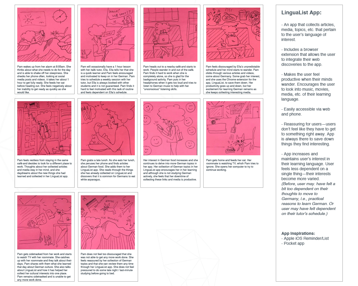
In this defining these two personas and understanding their habits and identities, I used Empathy Maps and Storyboarding.
POINT OF VIEW & HOW MIGHT WE | Using these two personas as frames of reference, I fleshed out POV statements and How Might We prompts to frame the problems, as such:
Point of View #1
"Pam the Procrastinator" has always been indecisive, but she has started learning German because she wants to move to Germany. Pam needs to feel more strongly about her decisions because she is afraid that she will change her mind about moving to Germany and consider her German "useless."
How might we... create and instill a stronger sense of certainty and purpose for Pam in her language learning?
Point of View #2
"Elvis the Entrepreneur" wants to learn Portuguese to better communicate with his Brazilian wife's family, but has a very busy work schedule. Elvis often puts off his language learning because he is the "all-or-nothing" type, and he is frustrated that he does not have enough time to fully devote himself to learning Portuguese.
How might we... help Elvis in structuring his learning schedule so that he feels productive in his language learning?
THE PROBLEM
Language learners can sometimes feel isolated in their different reasons for learning their target language. They can easily lose sight of why they want to learn their target language in the first place, and their initial motivations start to become stale.
Ideate
I used the Crazy Eights exercise to brainstorm and sketch out as many different solutions as I could.
From the sixteen ideas, I chose one (ultimately named "LinguaList"), to flesh out as my first prototype, as the solution it offered felt worth exploring:
LinguaList would provide a platform for users to form communities based on their reasons for learning their target language.
By prominently featuring a user's reasons for learning their target language, and using this data to connect him/her to other language learners, the app would serve as a support network, learning resource, and a source of inspiration.
With this chosen idea, I then sketched out a User Flow and created another Storyboard to show how users would interact with LinguaList.
Test
To test the landing page and the app concept, I used two methods:
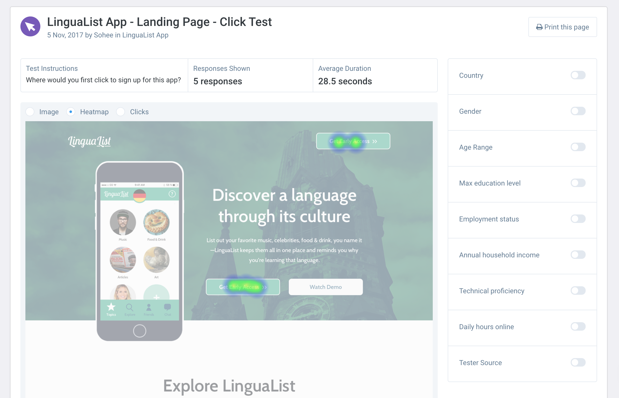
CLICK TEST HEAT MAP | We found through the Click Test heat map that the two desired Call to Action buttons were apparent enough to first-time visitors to the landing page.
USER INTERVIEWS | I spoke with the same users at the beginning of the project, as they had already passed the initial screening.
The reception was generally positive:
"It’s a good idea. Depending on whether I’d remember to use this instead of my normal Reminders app, I would totally use this."
Another had a thoughtful idea regarding content recommendation, which would possibly help generate revenue from sponsors:
"The biggest question that comes to mind is whether the app provides content recommendations in addition to collecting entries. I think offering recommendations would be a big selling point and it would help generate revenue if you have sponsored recommendations and iTunes/GPlay/Amazon integration."
One particular interviewee commented that some users may just want to connect with other language-learners in general, and be free to wander and look at other collections outside of their target language:
"I like that the app makes friend recommendations based on similar interests, but what would be more compelling to me is if the app matched you with users from other countries regardless of interests. That way you could look through their collection and see what’s popular in their native country."
Potential Improvements & Challenges
In addition to the the above, the feedback sparked other ideas for potential improvements:
NOTIFICATIONS | Like any app that requires motivation, LinguaList would need an effective, yet not too annoying way to ping users to use LinguaList instead of their other Reminder apps.
EASE OF SHARING | To encourage more community and interaction between users, LinguaList would need to make sure that resources are easily shareable between users, and even to people who have not downloaded the app (yet).
CREATING A SOCIAL NETWORK | As this is clearly not an easy feat, LinguaList would likely need to be integrated with social media such as Instagram or Twitter. As one user mentioned in his feedback,
"This would be very resource-intensive to pull off though because you would need a critical mass of users before it’s viable."
TESTING WITH A CLICKABLE PROTOTYPE | With a more fleshed out prototype (and not just a landing page), I would be able to better understand my users' frustrations, pinpoint the flaws of my app and its concept, and be able to reiterate until I have an impactful product that effectively motivates language learners.
I recognize that an app such as LinguaList could turn gargantuan, and if I were to pursue this concept, I would further test out these different directions to gauge interest and define a hierarchy for which features seem the most in demand.
See more work

A converged knowledge base for telecommunications agentsUX/UI, design system, WCAG

Redesigning the shopping experience for an e-commerce startupUX/UI, design system
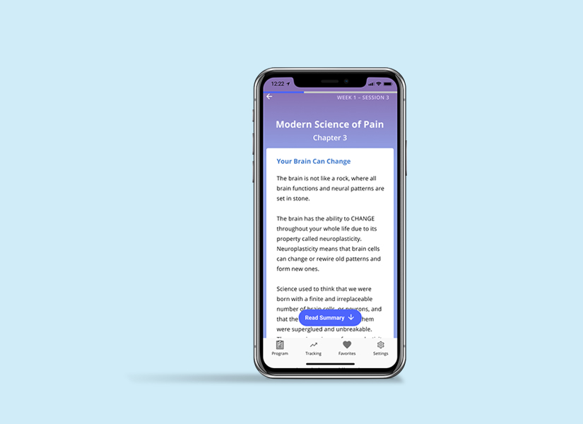
Mobile app design for guided pain managementResearch, UX/UI, design system
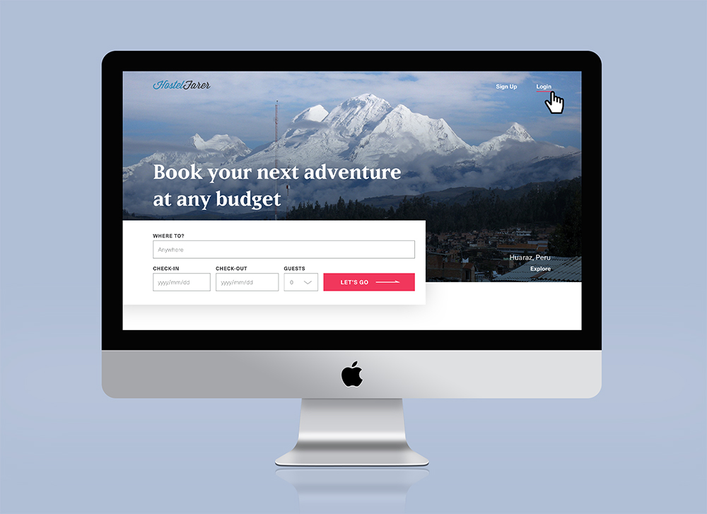
Website design for booking hostelsUI, design system

A Year of SoloPhotography, writing, book design

Self: A Portrait Through FilmData visualization

The JabberwockyIllustration
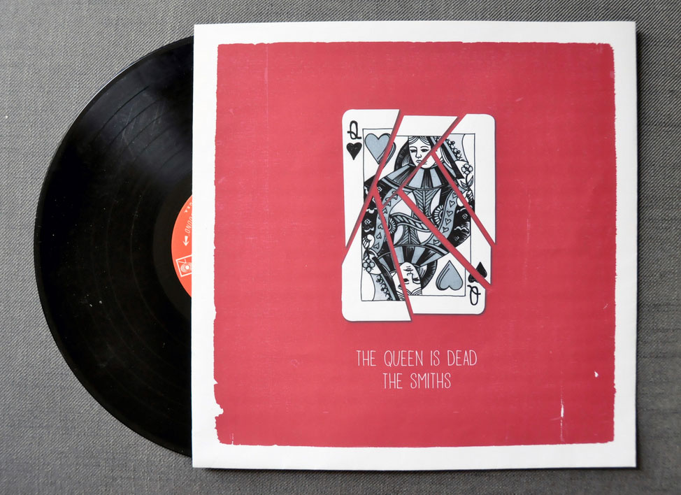
The Queen is DeadIllustration

A Food Blogger's Year in ReviewData visualization

MoistGraphic design

CabaretIllustration, graphic design

Penn Political ReviewIllustration
