The Inside
UX & UI Design (Figma)
Website | theinside.com
The Inside is an e-commerce startup whose mission is to make home decorating fun through customizable furniture.
As the sole in-house UX designer, I worked cross-functionally—but primarily with the engineers, e-commerce manager, and creative director—to provide the best shopping experience for customers.
Deployed projects include but are not limited to:
- Leading an entire website redesign incorporating the new design system
- Optimizing the checkout experience cross device
- Enhancing features on the product detail pages & category pages
- Building a design system using new brand guidelines
For more details about my work at The Inside, please contact me.
MENTIONS
ecomm.design | eCommerce Website Design Gallery & Tech Inspiration
Our Customers
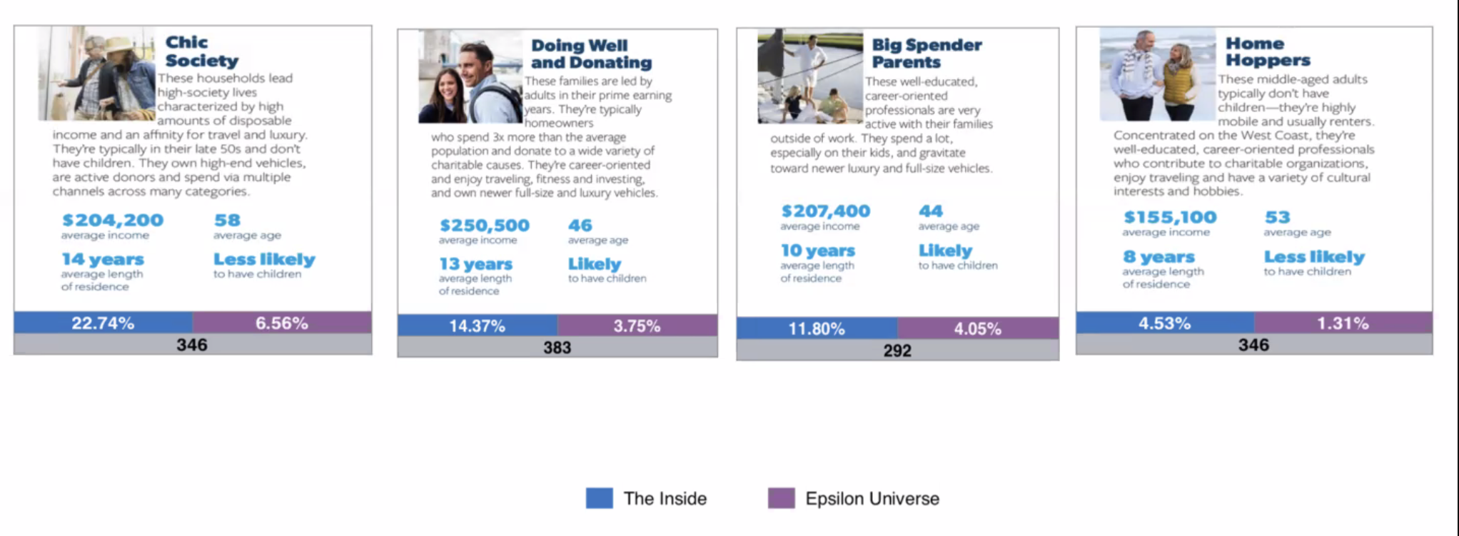
We found through this data that over half of our users were in their early 40s to late 50s, were likely homeowners, and were all in upper-middle class, dual income households. Many of them were from the South, where we surmised had homes with more space for furniture.
Product Detail Page (PDP)
Web & Mobile
7 weeks
As the main driver of revenue, the Product Detail Page redesign provided a huge opportunity to drive up conversion rates among customers. We found that many of our customers were merely exploring when on mobile—a behavior we wanted to encourage, as part of our mission to "create joy in decorating."
I joined forces with a short-term UX Contractor as he spearheaded the overall design and flow, conducted competitor analysis, and met with company executives for final approval. I fine-tuned details to make sure the UI was consistent with our brand guidelines, worked closely with the developers to bring the designs to launch, and continued to refine the PDP.
OUR SOLUTION
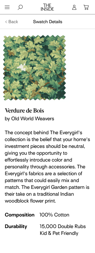
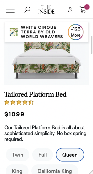
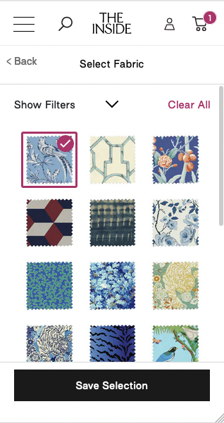
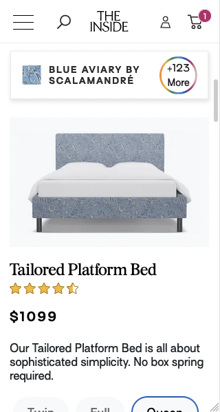
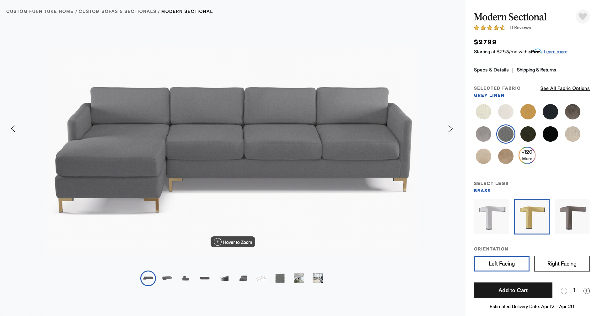
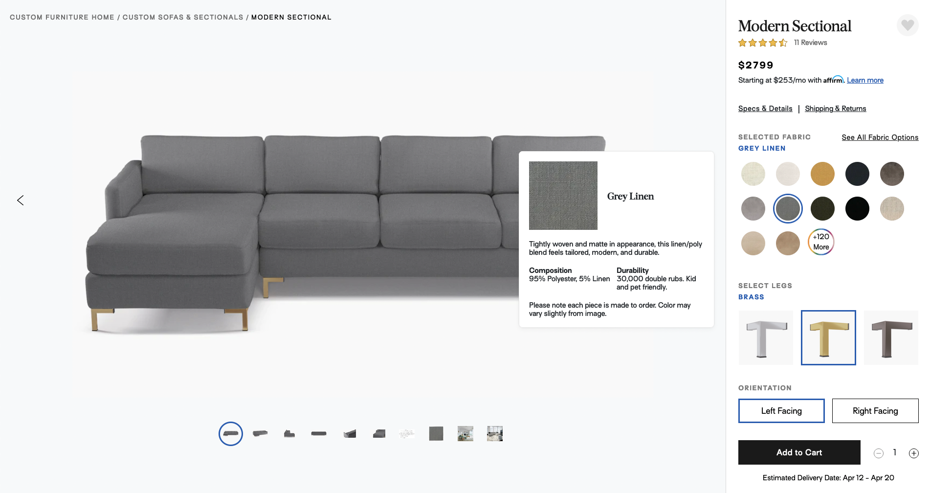
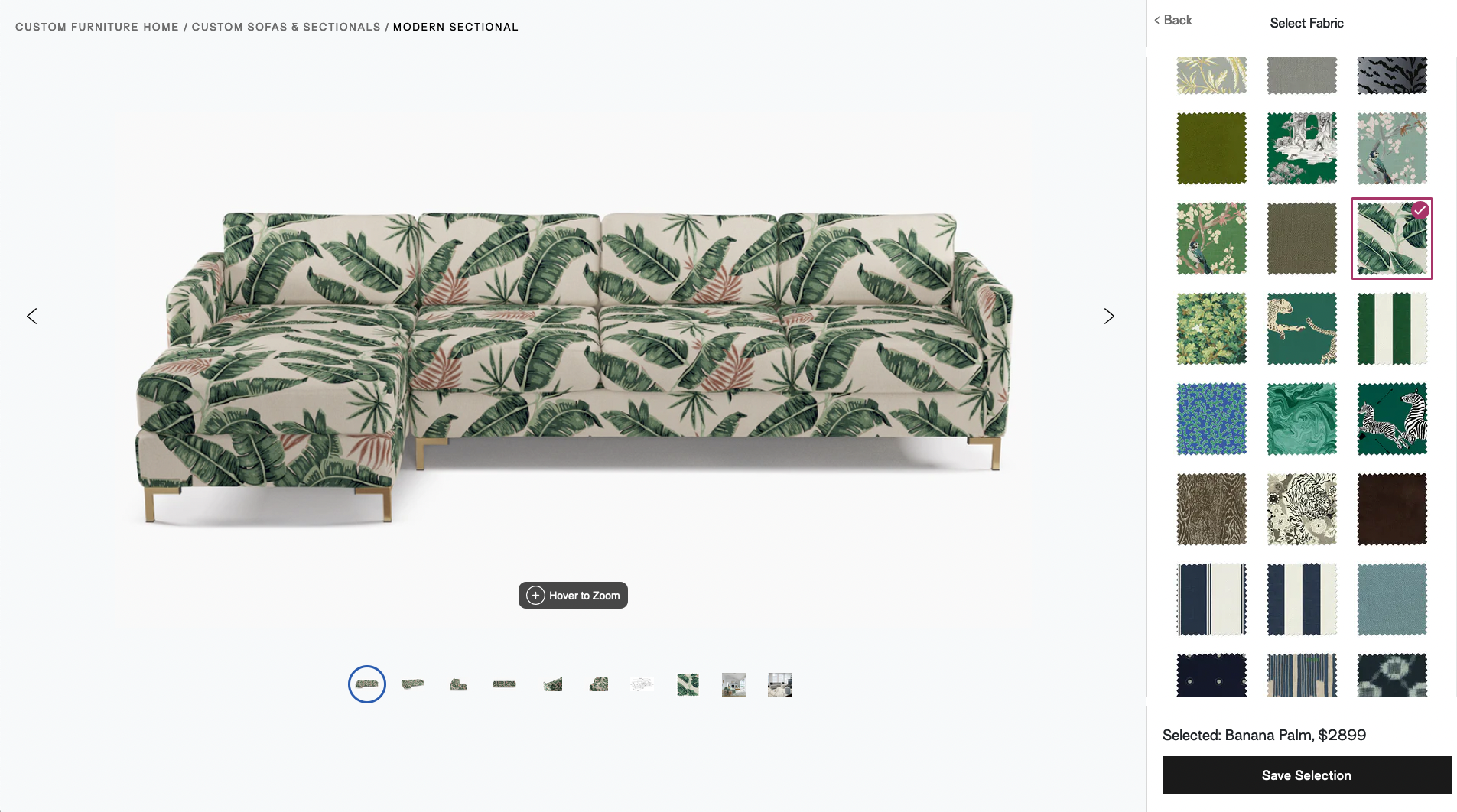
We restructured the page elements so that the variety of customization options was quickly accessible, yet not overwhelming. The new Fabric Customizer sorts over 120 different fabrics, and users can now easily click through different options and watch the product change live.
To foster a delightful furniture shopping experience, especially for our mobile customers, we made sure that the customizing UX was consistent and easy to use on both mobile and desktop.
LIVE WEB PAGE | Modern Sectional PDP
Category Landing Page (CLP)
Web & Mobile
7 weeks
The Category Landing Page was another exciting opportunity to get more customers to click into the different products ("View PDP") and ultimately convert. Similar to our objectives for the Product Page, we needed to convey the company's message that decorating is accessible and fun, but not overwhelming.
OUR SOLUTION
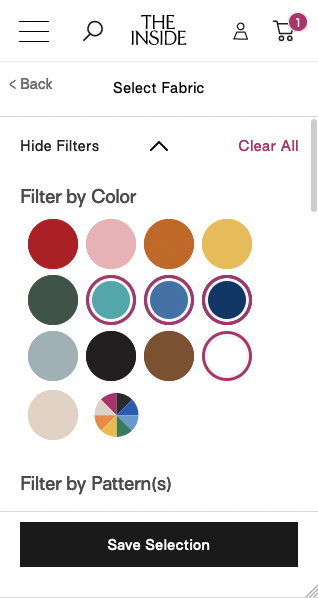
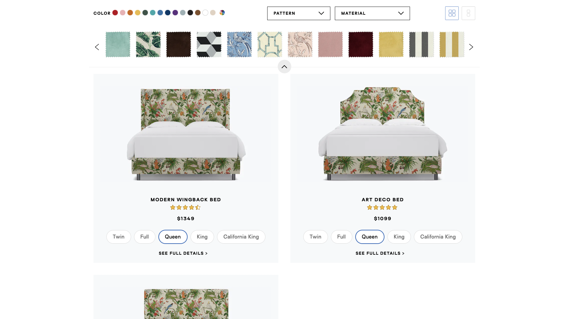
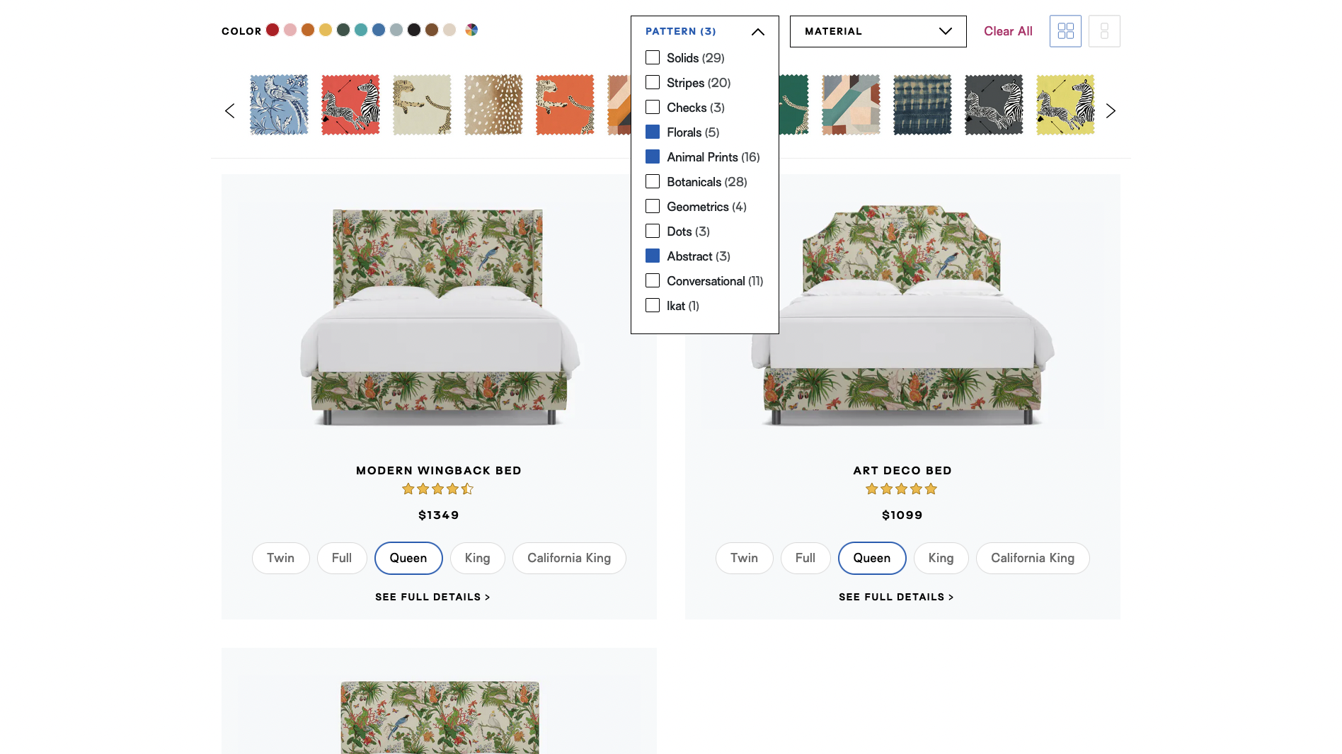
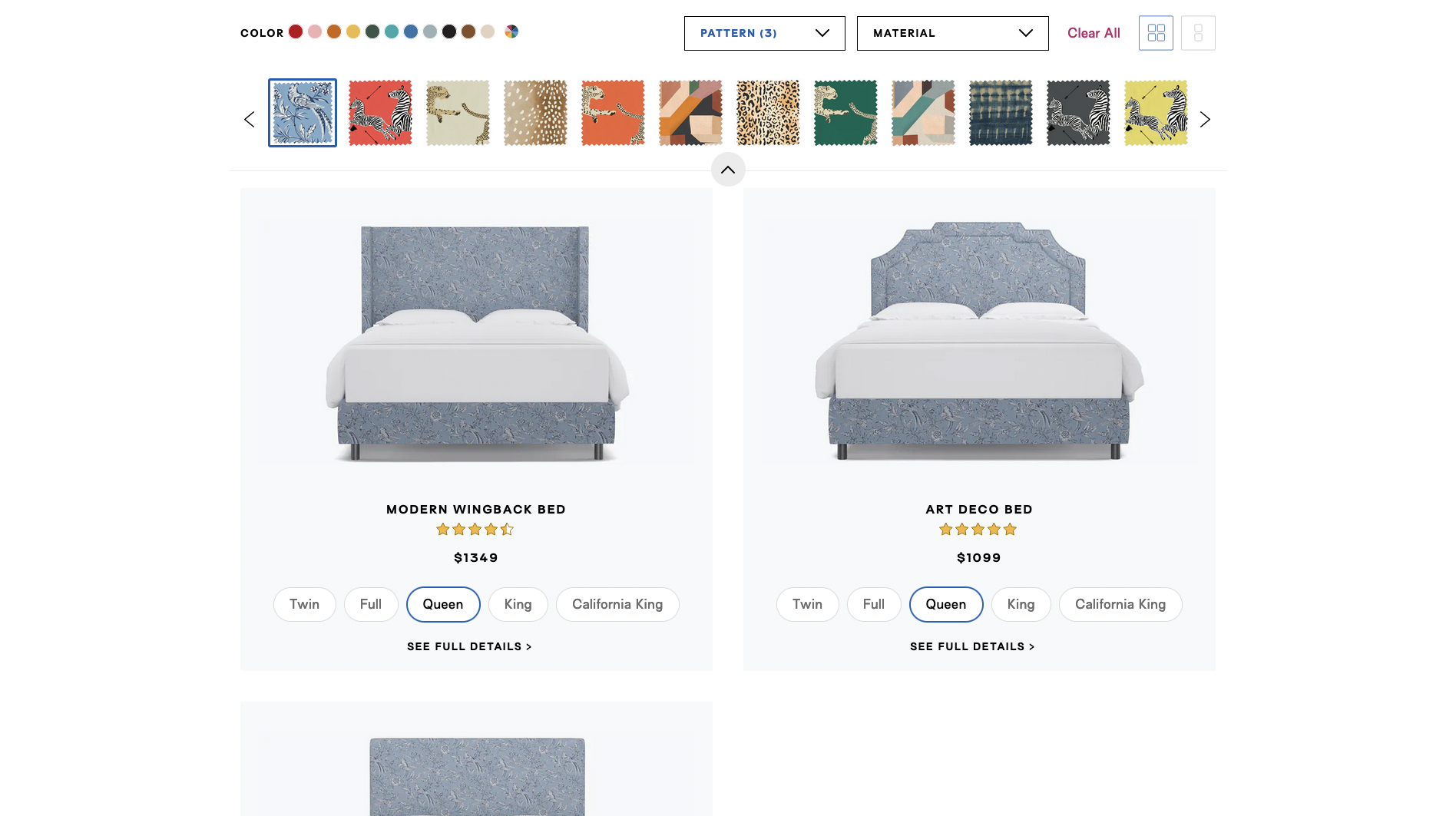
We created a Swatch Filter Bar fixed to the top of the pages, so that customers could sort and click through the different fabric options. Like in the PDP, the products would change live, for a more interactive and delightful purchasing experience. The product frames were laid out such that users could easily compare and decide which product they preferred.
As we found that many of our customers were in the exploratory phase on the category page, we reused some components from our new PDP's Fabric Customizer so that users could have a seamless experience on both mobile and desktop.
LIVE WEB PAGE | Custom Upholstered Beds
Performance Metrics
As the main success metric, we measured conversion rate—the percentage of site visitors who converted into buying customers.
To more specifically analyze the performance of our new Category Landing Page, we measured View PDP, which we hypothesized would greatly help in increasing the conversion rate as well.
The results were as follows.
1 month after Product Detail Page redesign:
+172.5% in conversion rate
While the main driver for this increase was a 2% conversion rate during a 4-day sale, the conversion rate still exceeded our month-to-date target by 73.8%.
LEARNINGS | We were not measuring week-over-week (WoW) metrics at the time, but having a closer time interval—rather than month-over-month (MoM)—would have been more accurately representative of our new PDP's performance. There were many moving parts and changes to the site every week that this +172.5% MoM conversion rate increase, while impressive, was not completely due to this PDP redesign.
A better metric would have been a WoW 'Add to Cart,' as the primary call-to-action of the product page.
1 week after Category Landing Page redesign:
+3% in View PDP
As we learned that more specific WoW metrics were necessary in such a fast-paced environment, we chose to use View PDP—the call-to-action of the Category Landing Pages—to measure how the new design performed.
MORE LEARNINGS | We found that by prioritizing View PDP, we were able to bring more users lower in the funnel that we could affect, and therefore increase our conversion rates.
Generally speaking, as these UX changes were released in the beginning of 2019, we surmised that a part of these increased conversion rates may also be attributed to the upward trend of online shopping and "home-optimizing" during the COVID-19 pandemic.
Design System
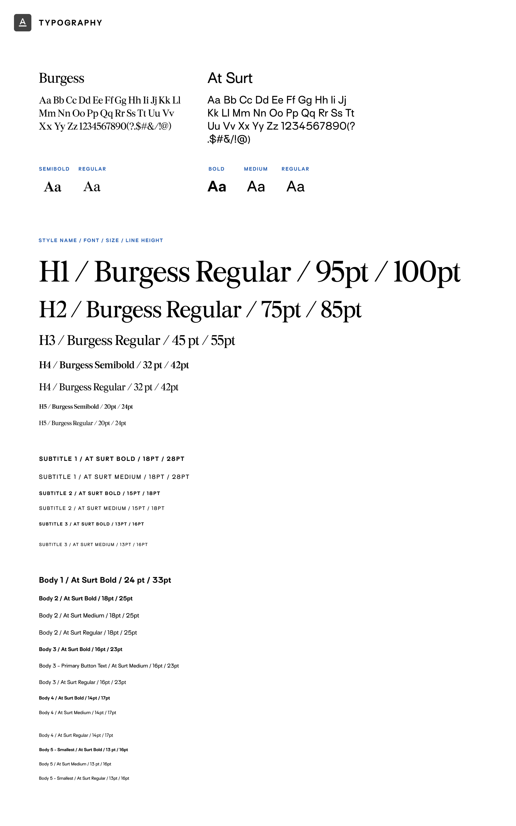
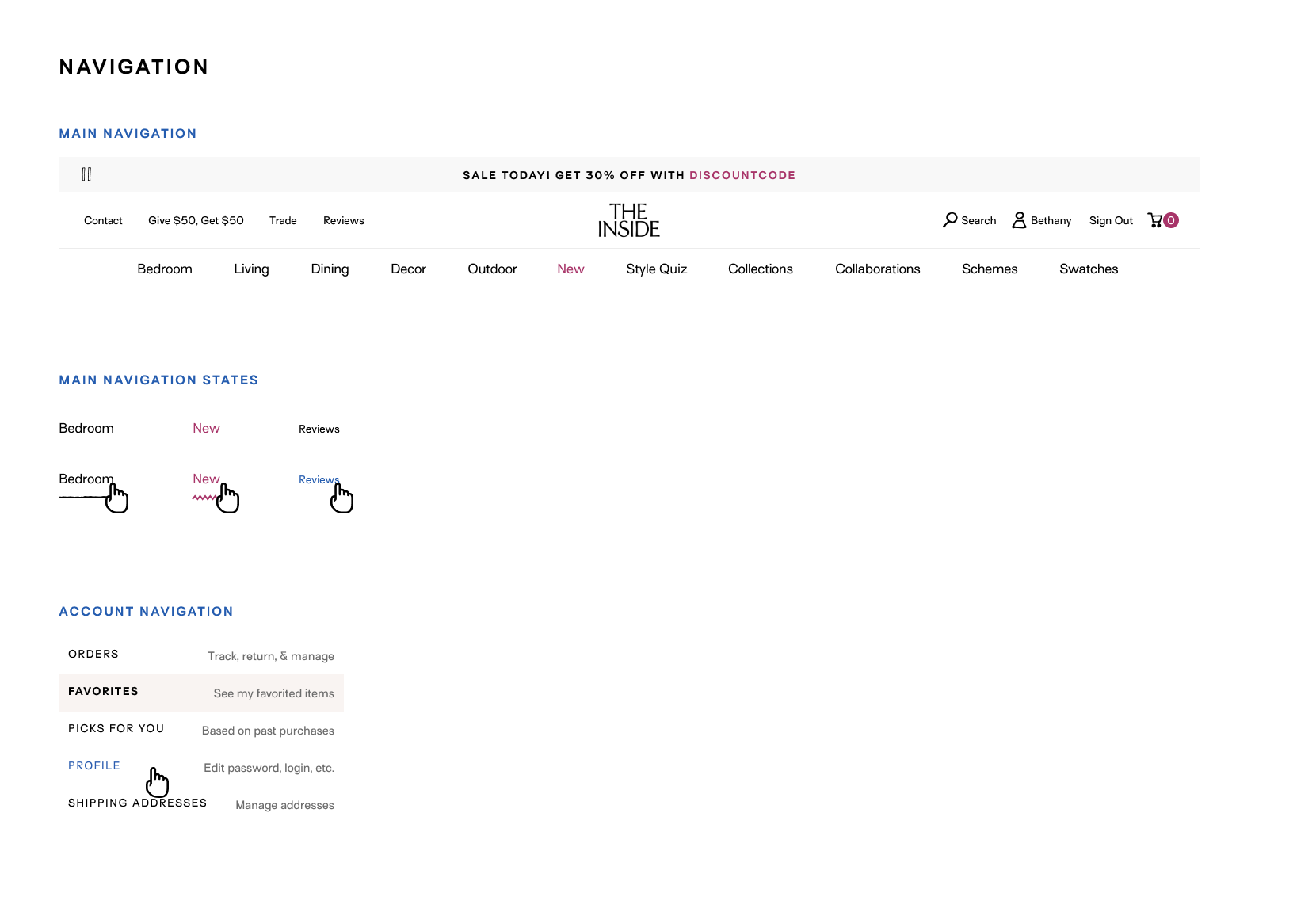
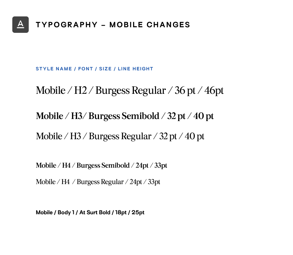
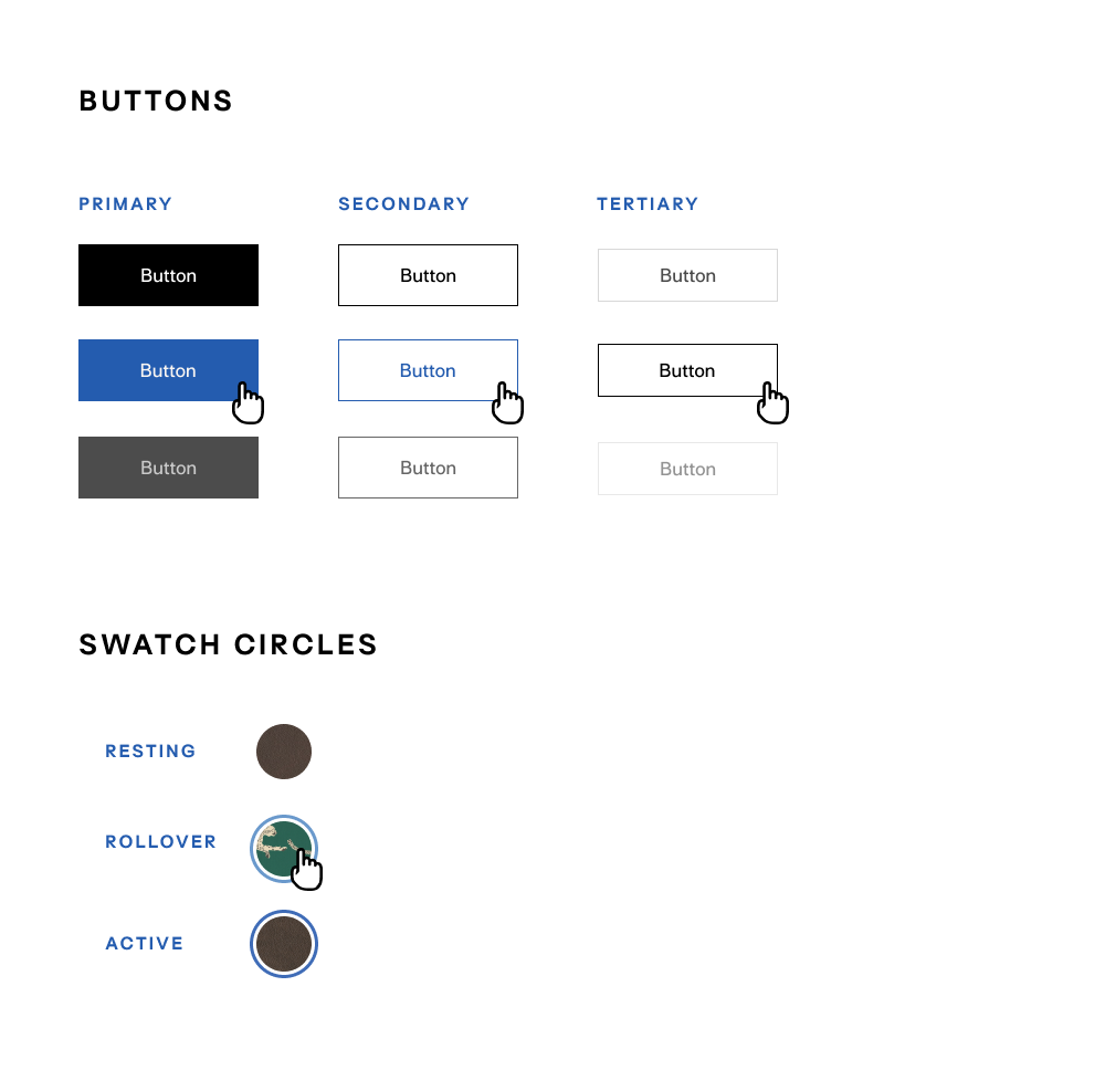
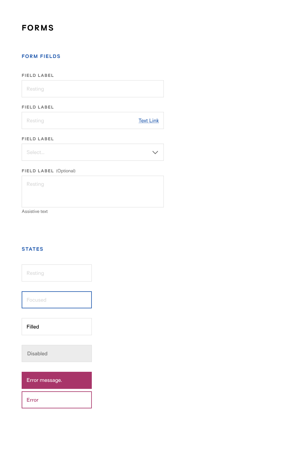
Using the company's brand guidelines as reference, I built a design system on Figma for desktop and mobile. I also created a component library, allowing me to design hi-fidelity wireframes with speed. This also provided the development team with all the standardized styling and component variations needed.
A portion of the design system is shown below:
See More Work

A Year of SoloPhotography, writing, book design

Comcast Xfinity: CelestialUX/UI, design system, WCAG
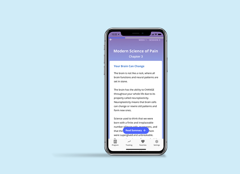
PelvicSenseResearch, UX/UI, design system
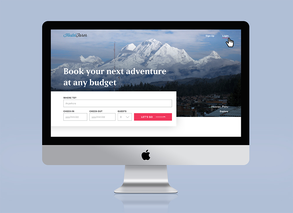
HostelFarerUI, design system
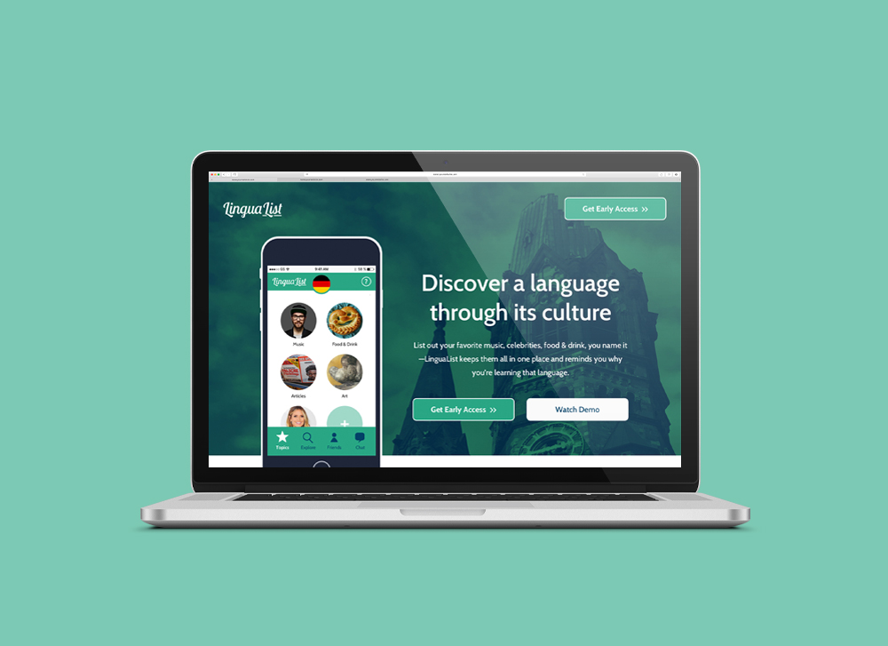
LinguaListUX, research

Self: A Portrait Through FilmData visualization

The JabberwockyIllustration
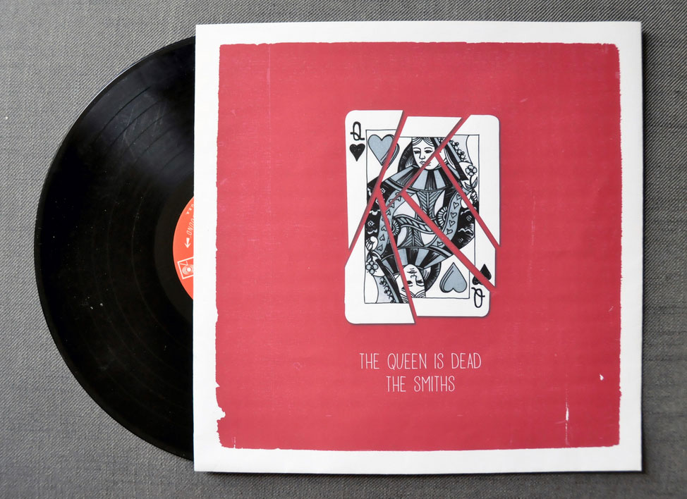
The Queen is DeadIllustration

A Food Blogger's Year in ReviewData visualization

MoistGraphic design

CabaretIllustration, graphic design

Penn Political ReviewIllustration
(c) 2024 Sohee Cha.
