Self: A Portrait through Film
Data Visualization & Graphic Design (InDesign, Illustrator, Excel)
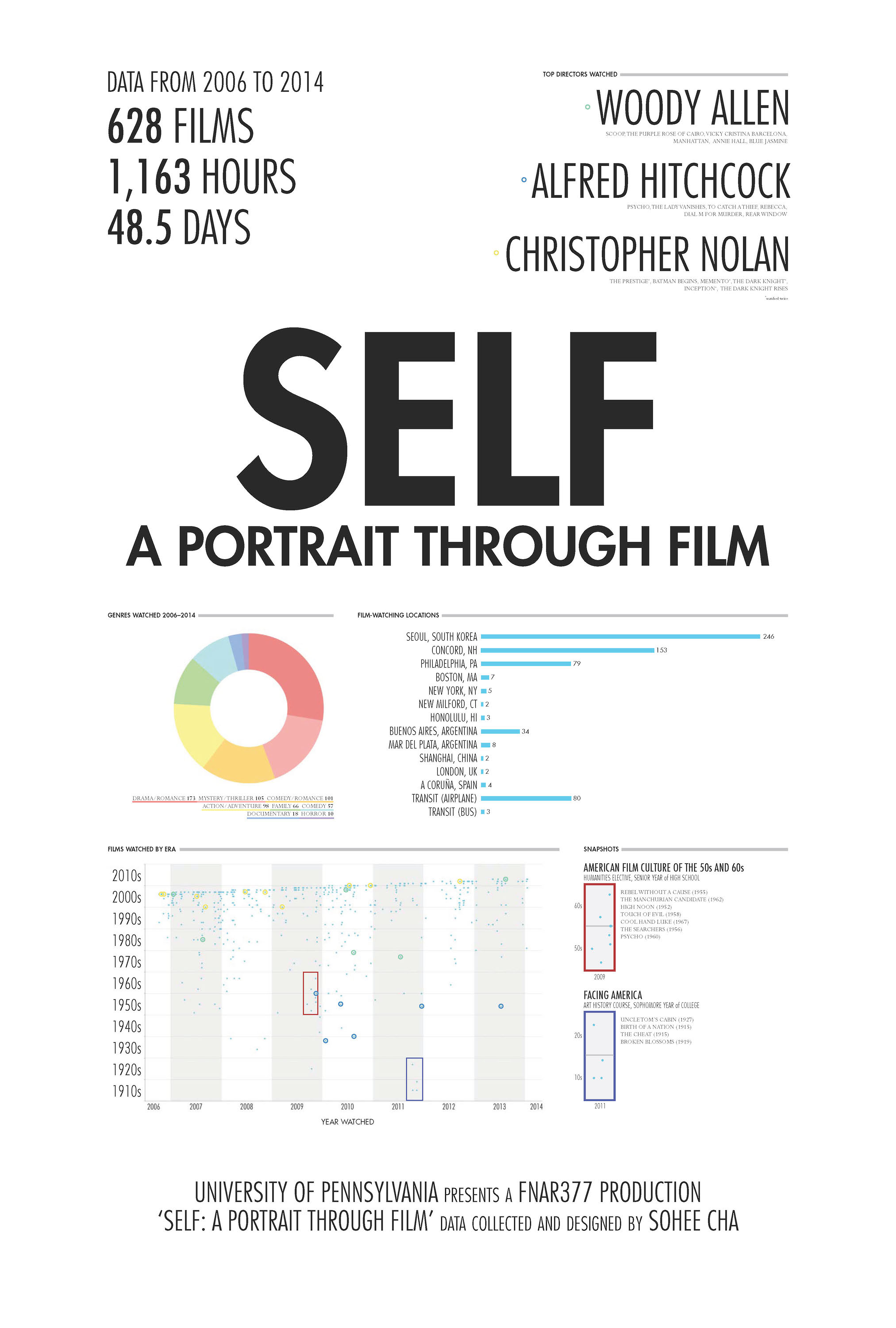
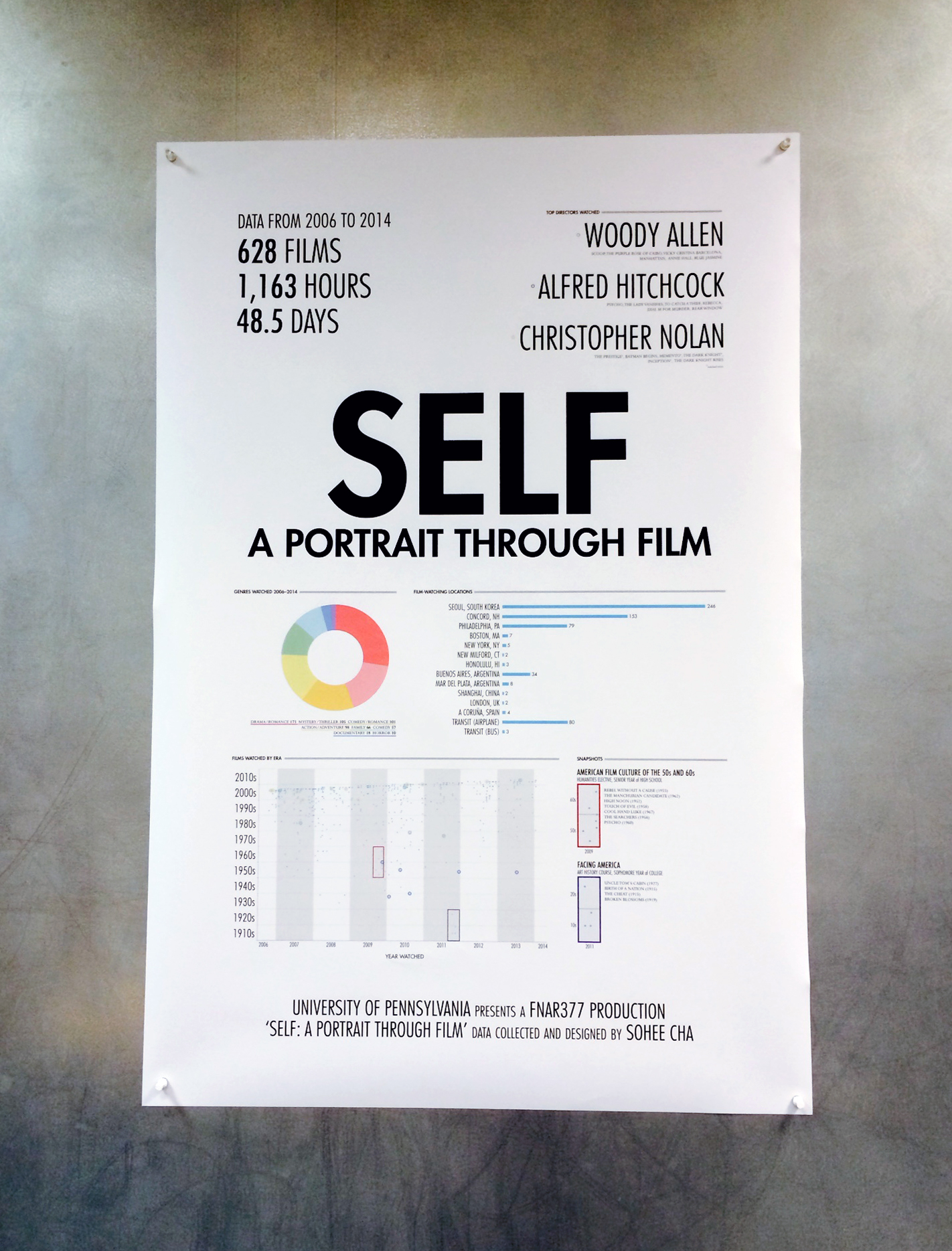
With a personal log of films watched from 2006 to 2014, I created a "self-portrait" in the form of a data visualization. Drawing inspiration from Nicholas Felton's annual Feltron Reports, the final product is a 27x40" printout designed to resemble a movie poster.
What the Data Taught Me
A frequently watched film doesn't necessarily mean it's a favorite.
I held the initial assumption that the more I liked a film, the more I would watch it—and I could see what my favorites were by analyzing this data (sorted by watch frequency).
What I had deemed my "favorites"
- Directors: Lucrecia Martel, Christopher Nolan, Wes Anderson
- Genre: Mystery/Thriller
What I watched the most, according to my movie log
- Directors: Woody Allen, Alfred Hitchcock, Christopher Nolan
- Genre: Drama/Romance
Even when looking at these results, I did not come to the realization that Woody Allen was indeed my favorite director—in fact, I felt a little surprised (editor's note from 2021: and now, maybe feeling a little awkward) that this is what my movie log data was telling me. Unfortunately, my log did not include my rating of the movies, so I was unable to conduct a more straightforward data analysis.
The project brought me to consider the following:
How do we know whether the data is measuring what we think it is measuring?
And how can we keep our minds open so that we don't jump to the wrong conclusions?
Potential Improvements & Future Opportunities
GENRE SORTING | When categorizing the log of films into different genres, I had difficulty in sorting the more multi-genre movies. In the future, I would have written down a standardized criteria for each genre so that I could minimize any arbitrary decision-making and be more structured in how I made my genre-sorting decisions.
MAKING IT DIGITALLY INTERACTIVE | By converting this movie log into something more digital and interactive, I could create flexibility in how I could sort and manipulate the data. Others can also input their own movie logs and also look at their data from different angles, and perhaps even gather some insight about themselves from their film-watching behavior.
(Believe it or not, I am still logging my list of watched movies up 'til today, 2021.)
See more work

A converged knowledge base for a telecom appUX/UI, design system, WCAG

Redesigning the shopping experience for an e-commerce startupUX/UI, design system
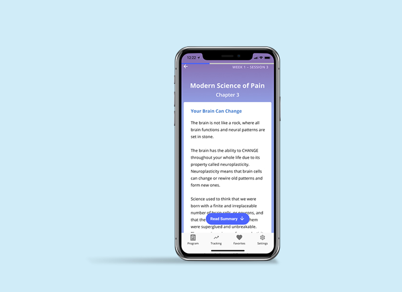
Mobile app design for guided pain managementResearch, UX/UI, design system

A list-making mobile app for language-learnersUX, research
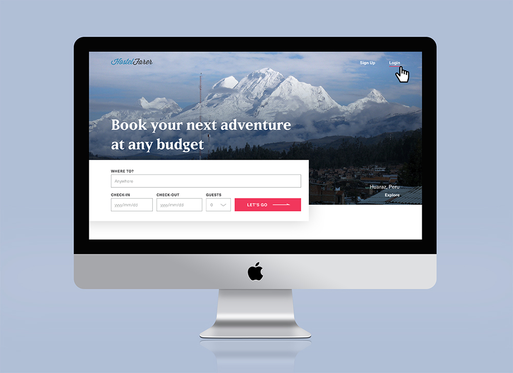
Website design for booking hostelsUI, design system

A Year of SoloPhotography, writing, book design

The JabberwockyIllustration
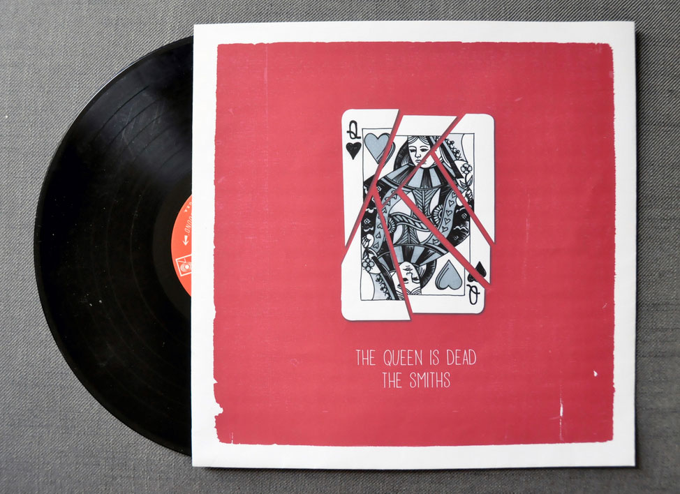
The Queen is DeadIllustration

A Food Blogger's Year in ReviewData visualization

MoistGraphic design

CabaretIllustration, graphic design
