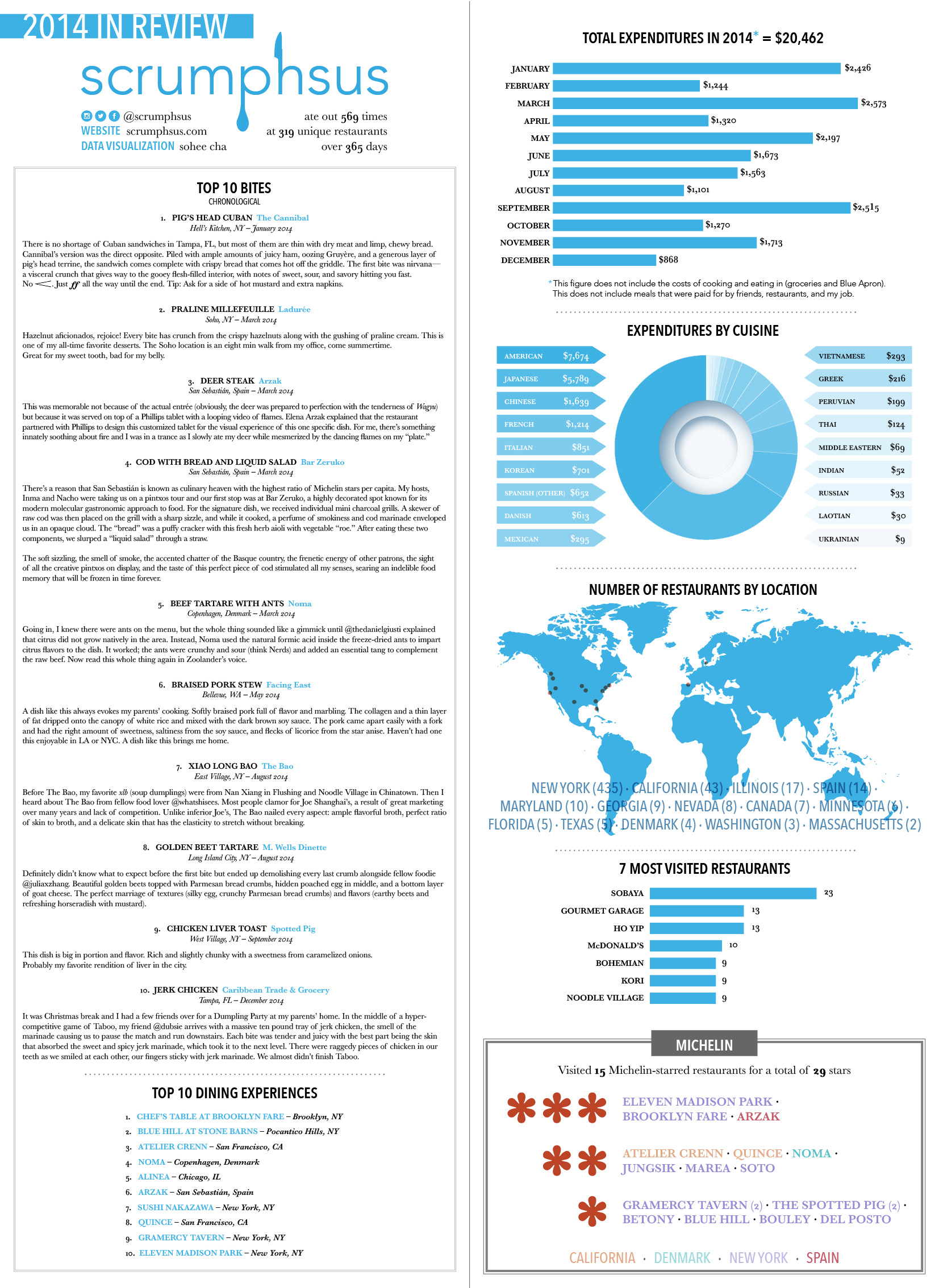
A Food Blogger’s Year in Review
Data Visualization & Graphic Design (Adobe InDesign, Illustrator)
scrumphsus is a web- and Instagram-based food blogger who showcases various restaurants and food both locally and internationally. I collaborated with scrumphsus and a developer to analyze, sort, and create a year-in-review data visualization for 2014.
The overall layout and typography was inspired by menu designs as a nod to the blog's focus on food.
BLOG POST | 2014: Year in Review
Note to Self
ACCESSIBILITY | For the future, I would be more mindful of color selection and contrast so that the final design is ADA compliant. I would also avoid a color-dependent key for the "Michelin" section so that the data visualization is more inclusive of color-blind viewers.
See more work

A converged knowledge base for a telecom appUX/UI, design system, WCAG
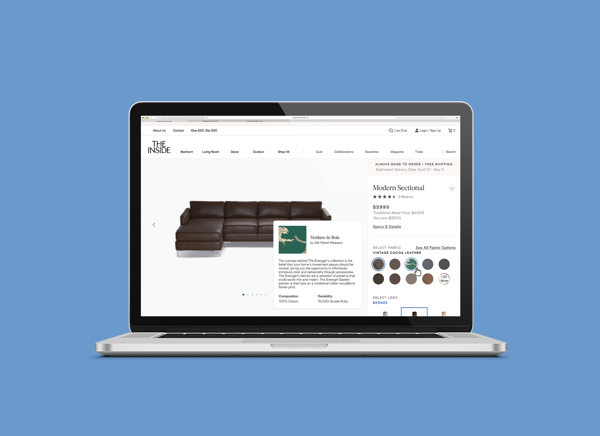
Redesigning the shopping experience for an e-commerce startupUX/UI, design system
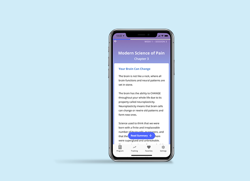
Mobile app design for guided pain managementResearch, UX/UI, design system
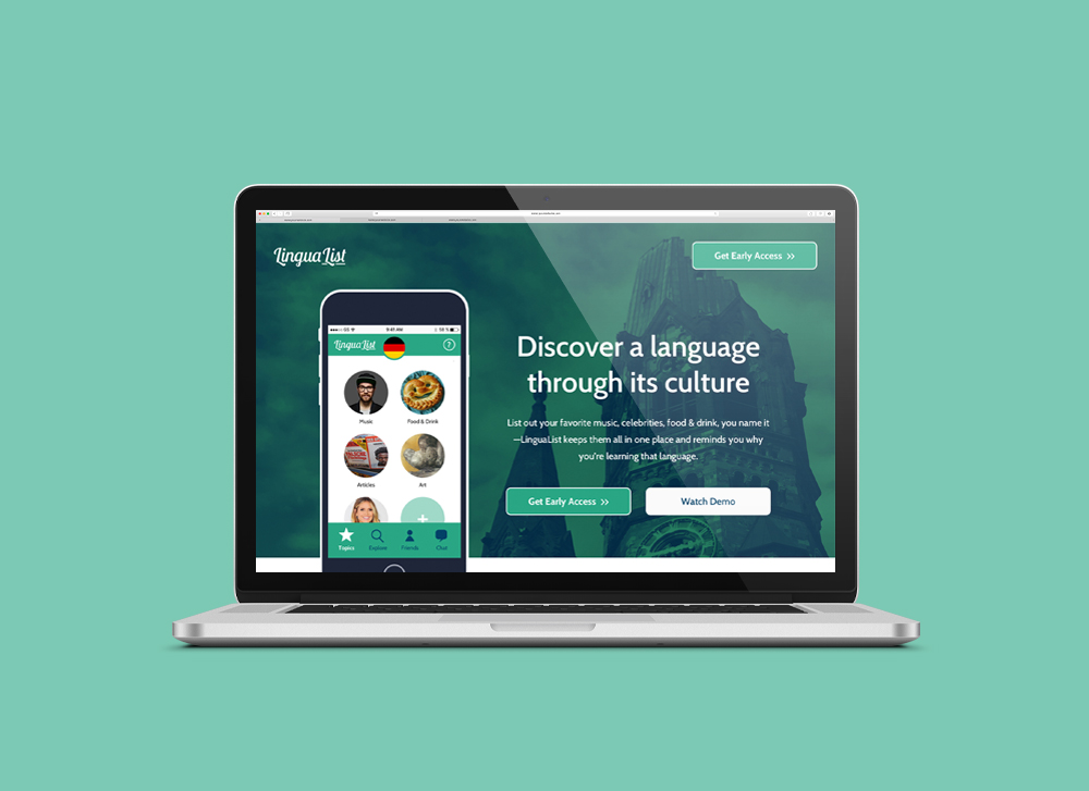
A list-making mobile app for language-learnersUX, research
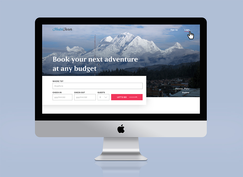
Website design for booking hostelsUI, design system

A Year of SoloPhotography, writing, book design

Self: A Portrait Through FilmData visualization
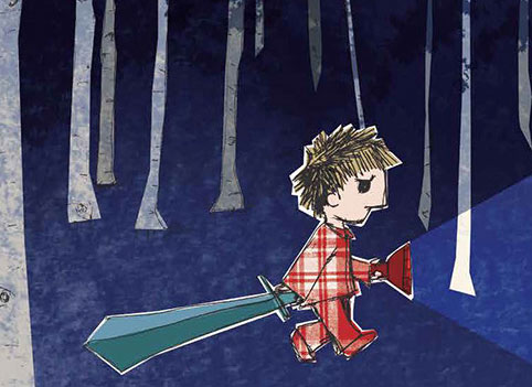
The JabberwockyIllustration
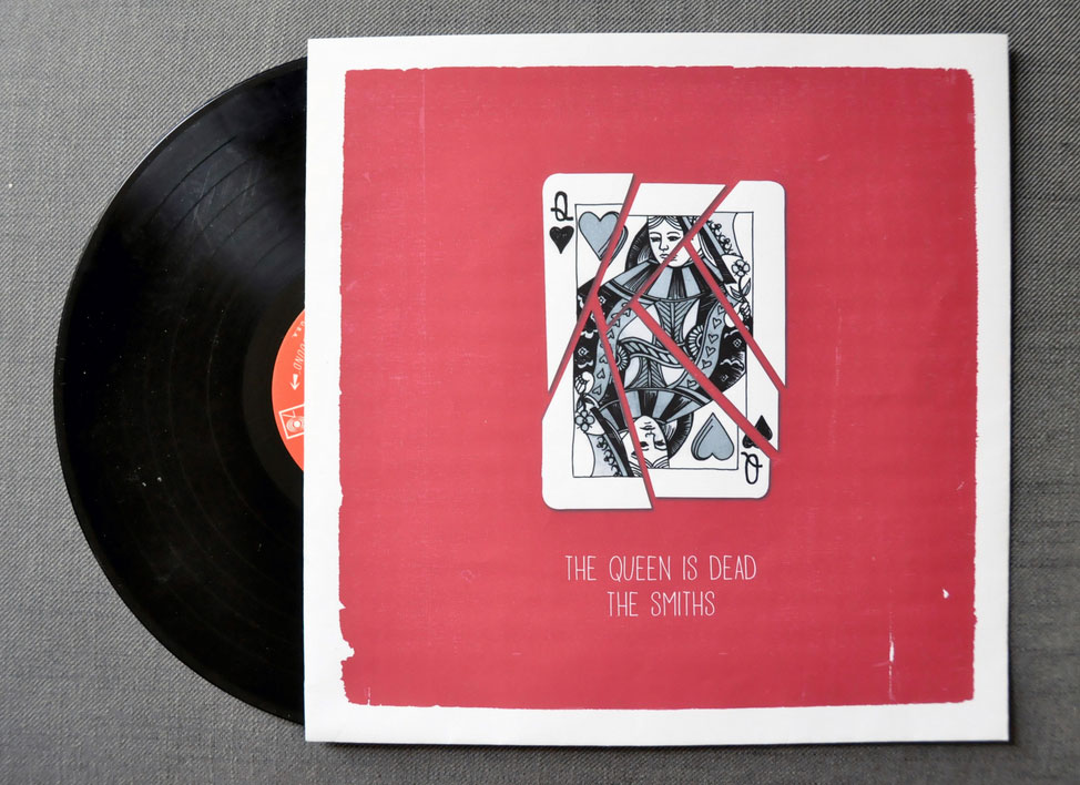
The Queen is DeadIllustration

MoistGraphic design
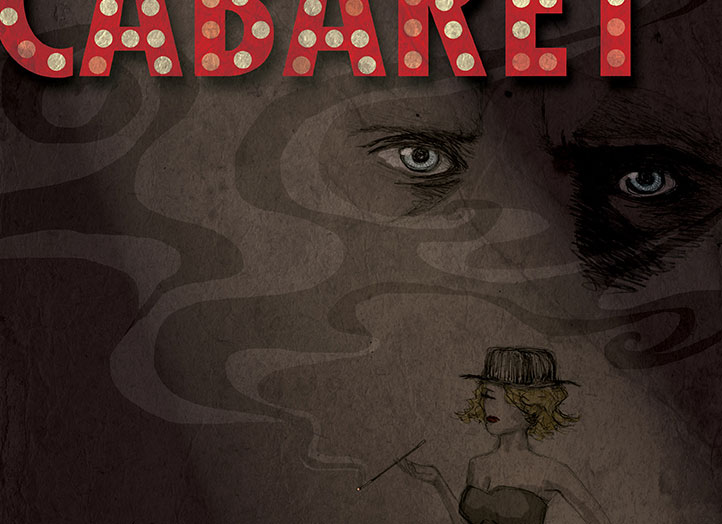
CabaretIllustration, graphic design