Mobile app design for guided pain management
Mobile app design for guided pain management
PelvicSense
According to a recent study, 1 in 7 women suffer from chronic pelvic pain, and an estimated 50% of cases remain undiagnosed. Another article states that more than 10% of men are affected by chronic pelvic pain at any given time.
I joined as one of two UX designers to help EMH Physical Therapy improve the usability and update the interface of their existing app, PelvicTrack. PelvicTrack was for those suffering from chronic pelvic pain, and was an app version of a successful in-person program that our client had designed herself.
This project became PelvicSense, an entirely new mobile app design that aimed to fully unlock the potential of our client's pelvic pain program in a gentle, usable, and useful way.
MAY 2020 UPDATE | Due to COVID-19 constraints, the PelvicSense app development was postponed and was released instead as a course on Kajabi for both web and mobile.
All images are property of PelvicSense.
Role
Product Designer
Graphic Designer
Services
UX/UI Design
Mobile app design
Design system
Logo design
Team
UX designers (1+me)
CEO (1)
Duration
6 months
Exploration & Ideation
Exploration & Ideation
Our first kickoff meeting with various stakeholders—which included the CEO and two other physical therapists in the company—helped pinpoint the underlying issues of the existing app, PelvicTrack. In addition to the general dissatisfaction with the app's usability, we discovered that PelvicTrack did not embody the business goals that the client had envisioned.
PROBLEMS WITH EXISTING APP
Users found the app's library of exercises hard to navigate, and could only use the existing app with a therapist's heavy guidance. But not all users could afford paying for a professional.
The existing app only held 1/3 of the client's in-person program, which produced great results in patients who were able to go through the program in full.
First-time users of the existing app found the information "overwhelming." This especially was an issue, as pelvic pain patients required low stress to not flare up their symptoms and worsen their pain.
IS THIS WORTH SOLVING?
Our client's in-person pain relief program had a lot of proven success with her patients, but it seemed from PelvicTrack's confused users that this existing app was not unlocking the program's fullest potential.
OUR SOLUTION / HYPOTHESIS
After much deliberation, the project scope was redefined: we would design a new app entirely from scratch, which eventually would be named PelvicSense.
We hypothesized that if we factored in sensitivity to specifically chronic pain patients and allowed users to track and see their day-to-day progress, we could motivate our users to keep using the program and make greater strides in their healing journey.
Lo-Fidelity Wireframes
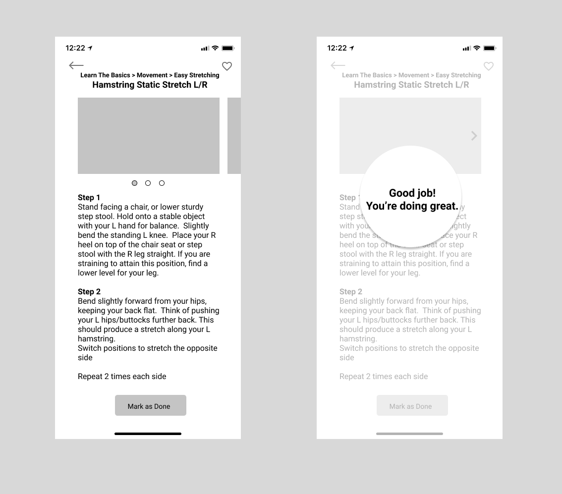
Using our research insights from user interviews, we built low fidelity wireframes and prototypes on Figma.
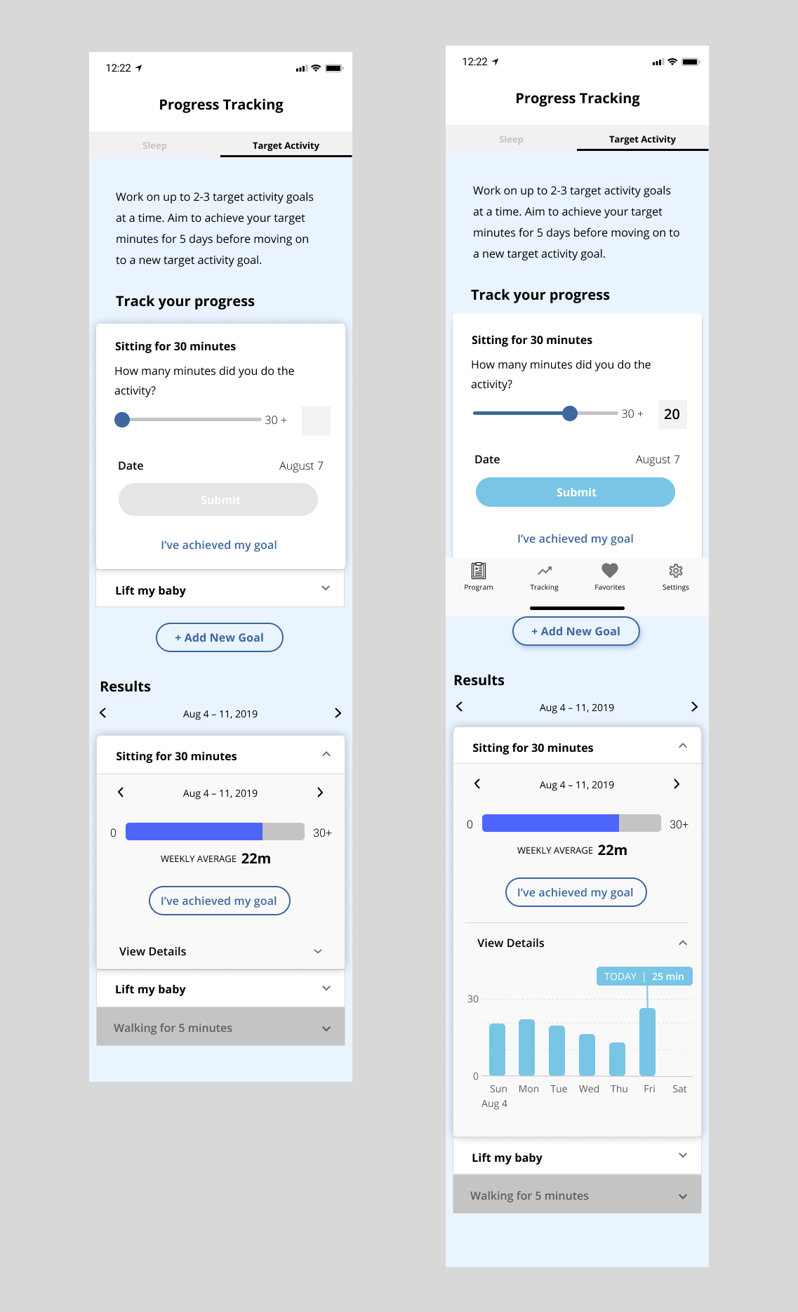
PROGRESS TRACKING | We created a "Target Activity" section that allows users to input their own short-term goals and track their progress. We hoped that with day-to-day encouragement, nudges from progress bars, and the visualization of their data inputs, users would feel motivated to come back to the program.
Getting Initial Feedback
USABILITY TESTING| We reached out to our client's existing patients, and received responses from 7 pelvic pain patients. We met with them individually (both in-person and on Skype) to gain further insight on our lo-fidelity prototypes.
The typical procedure was as follows:
- Briefly explain to the user about the user testing process, and to ask them to talk aloud as they interact with the app.
- Give the user the prototype on a phone (using the Figma Mirror app) without any prior knowledge of the app's purpose.
- Observe, listen, and take notes as the users navigated the app.
- Ask if they had any questions, test users' understanding of the app and its purpose, note their frustrations, and measure app usability using the 10-item System Usability Scale (SUS).
The SUS score average was in the 83rd percentile.
Implementing Feedback & Hi-Fidelity Wireframes
CLARITY > CAREFUL PHRASING| According to our user feedback, what was intended to be gentle, tactful instructions was seen as confusing and verbose. We cut down on our copy, and kept our CTAs clear—for this specific screen, we clarified our CTAs to just two ("Submit" and "I've achieved my goal").
Our goal was to keep the app clear and simple, so that there was the least amount of friction when users wanted to input their progress and track their goals.
MAKING SURE USERS SEE THEIR RESULTS | We noticed in usability tests that users did not scroll down on the Target Activity screen, and therefore did not get to see their tracked Results that were further down the page.
As we had hypothesized that users' seeing their results and progress was integral in motivating them to continue using the program, we put the Results page on a separate toggle.
Learnings & Room for Improvement
I learned many things from this project—it was my first UX gig with a paying client, after all. These specific learnings stuck out to me, as something to keep in mind for the future and to help me become a better designer:
IMPORTANCE OF TIME CONSTRAINTS | We started PelvicSense as a pro bono project with no strong deadlines, and this ambiguity fed into other parts of the project. The project often would drift and expand in scope, and while we regularly touchbased with our client to refocus on business goals, our project would have greatly benefited from having some type of timeline. Having time constraints would have forced us to build an MVP quickly, and adjust from there as we got feedback from actual users of the app.
IMPORTANCE OF WORKING ALONGSIDE DEVELOPERS | Without developers, it was difficult to address potential issues and understand better what takes more vs. less development time. Luckily, I had a couple of mobile developer friends who agreed to look over our later wireframes (and not charge us), and my co-designer and I addressed the concerns that were raised. Yet, PelvicSense was still made in somewhat of a "designer bubble," and the design process could have been far more efficient if we were working in tandem with the React Native developer(s) who would be implementing the app.
COVID-19 Constraints
POSTPONING APP DEVELOPMENT | While the initial intention was to develop this program as an Android & iOS app in React Native, COVID-19 posed new problems and constraints on our client. The development of PelvicSense as a mobile app was put on hold, but was instead released as a course on Kajabi in late 2020 / early 2021. This significantly cut costs, while still putting the gently framed program content out there in the public.
FEEDBACK & METRICS FROM ACTUAL APP USERS IS STILL TBD | The app was released under the Kajabi course, and we are still gathering feedback from patients enrolled under PelvicSense. In the meantime, our client sent an email a few months after the Kajabi course's launch:
“On Kajabi, instead of starting an app from scratch, I wrote the program using what you and Casey developed to make the course flow super well. It looks really good and I couldn’t have done this without your help. We are slowly gaining traction with a few members and doctors referring to the program for their patients. I receive many compliments on the design!”
With more live feedback from actual users, we would ideally be going back to our hypothesis and see if the app/course or even our business goals need adjusting. After all, our ultimate goal is to help pelvic pain patients in their healing journey, and an app/course that does not tap into their needs or motivate them to use the program at all means that there is much room for improvement.
Design System
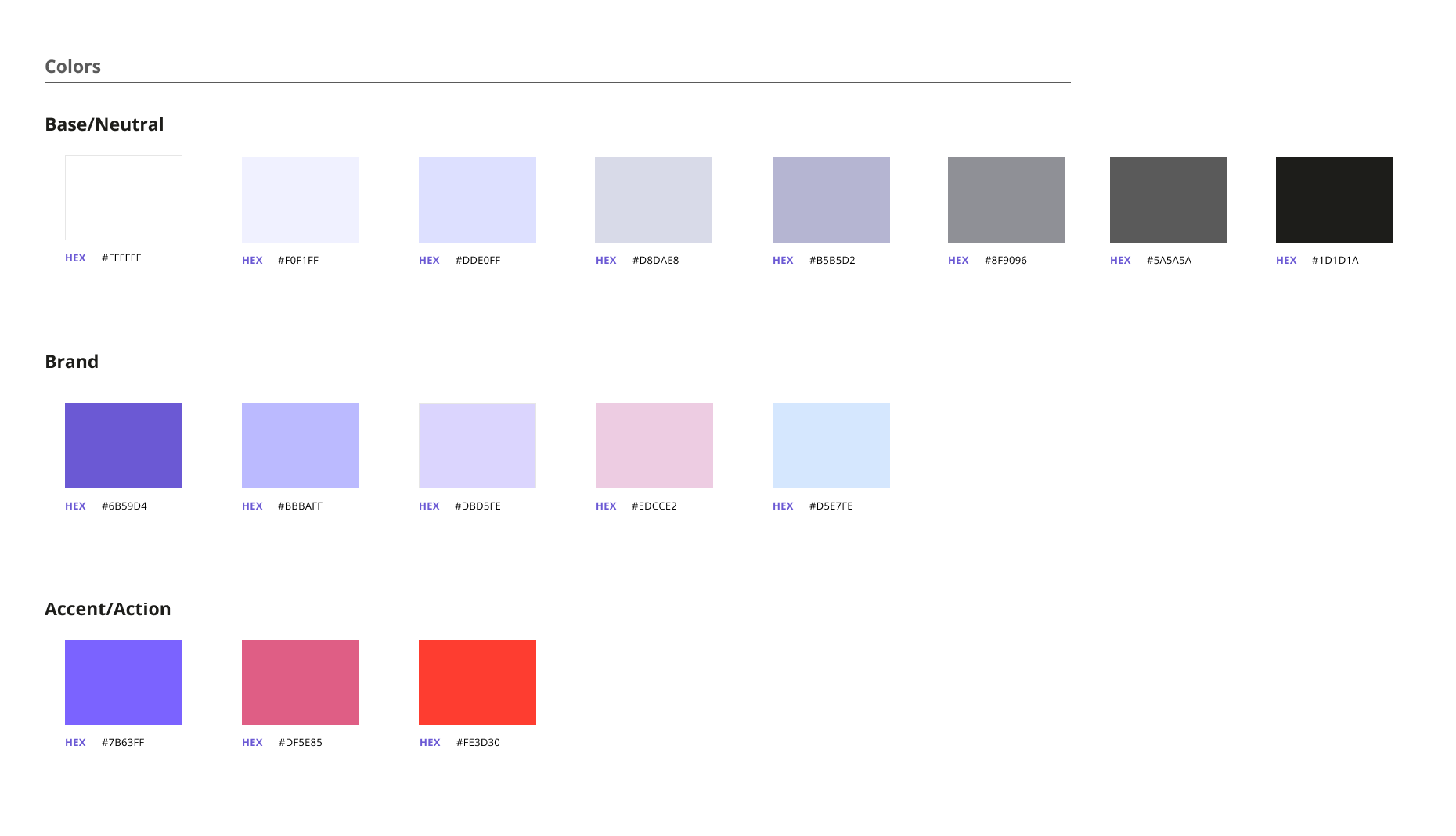
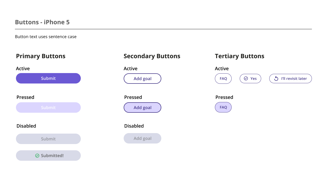
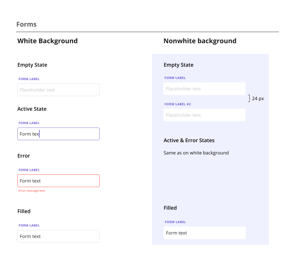
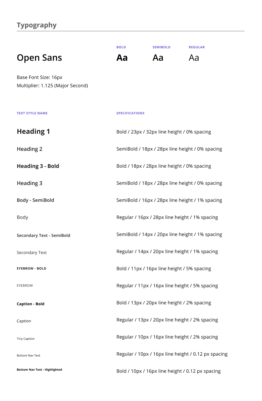
We built the design system and component library from scratch on Figma. Unfortunately, our contract timing did not line up with the development team, so we provided a detailed write-up, user flows, and motion designs for the mobile developers.
PelvicSense Logo
As a former graphic designer, I took on designing the logo with the CEO's input.

See more work

A converged knowledge base for a telecom appUX/UI, design system, WCAG
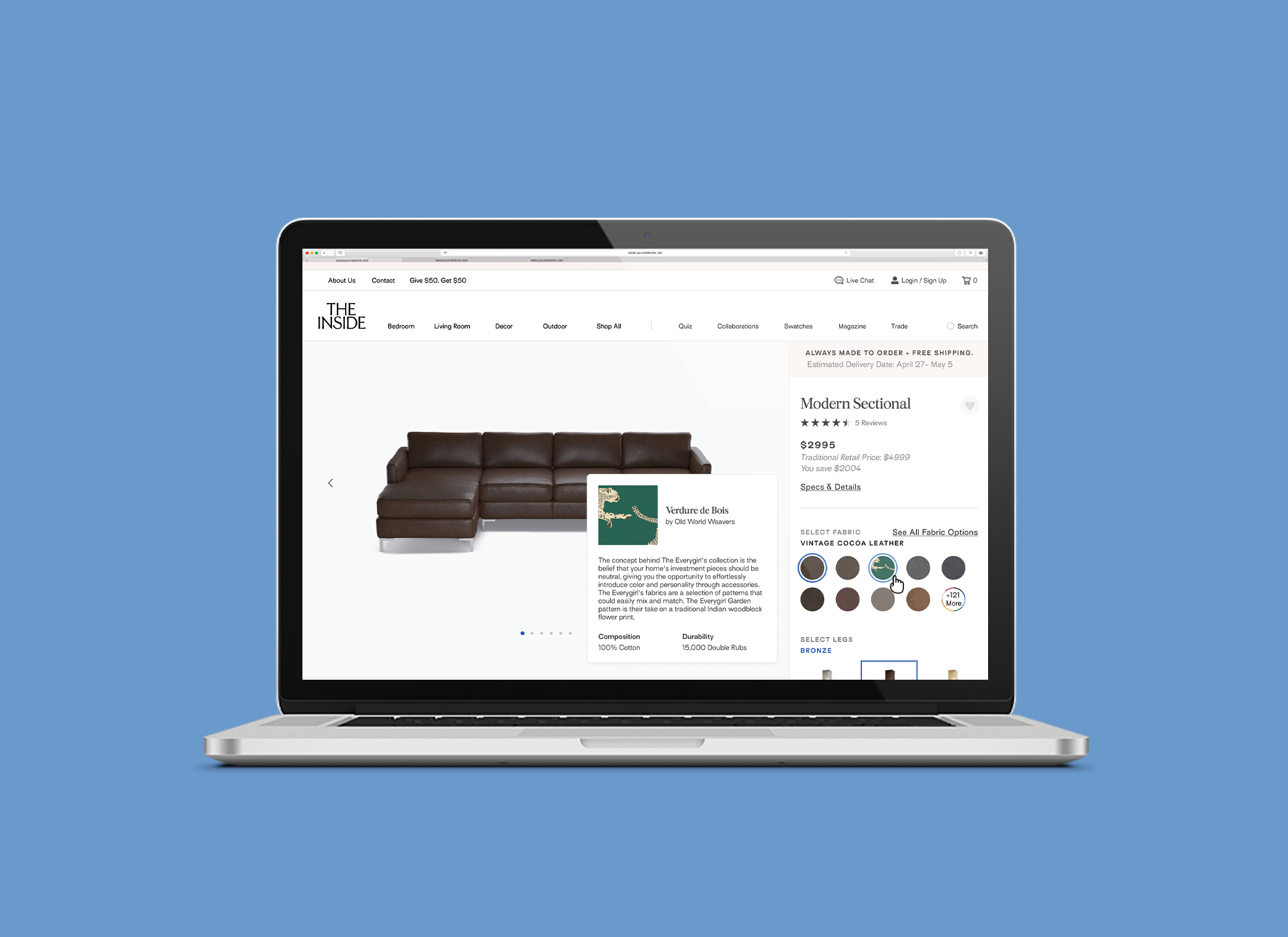
Redesigning the shopping experience for an e-commerce startupUX/UI, design system
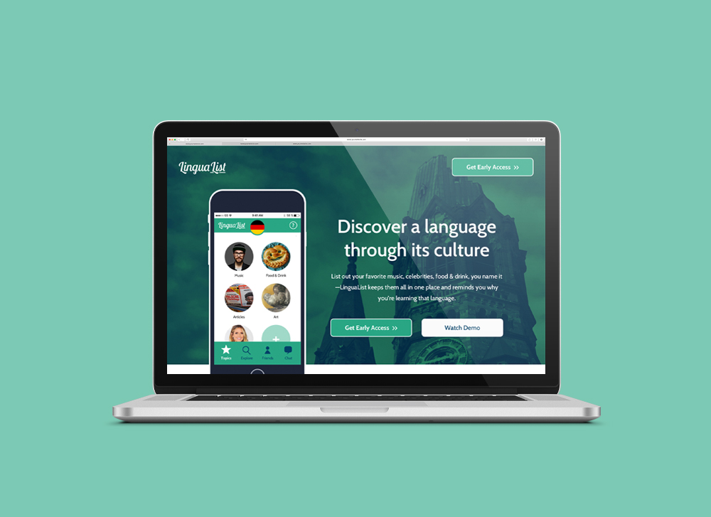
A list-making mobile app for language-learnersUX, research
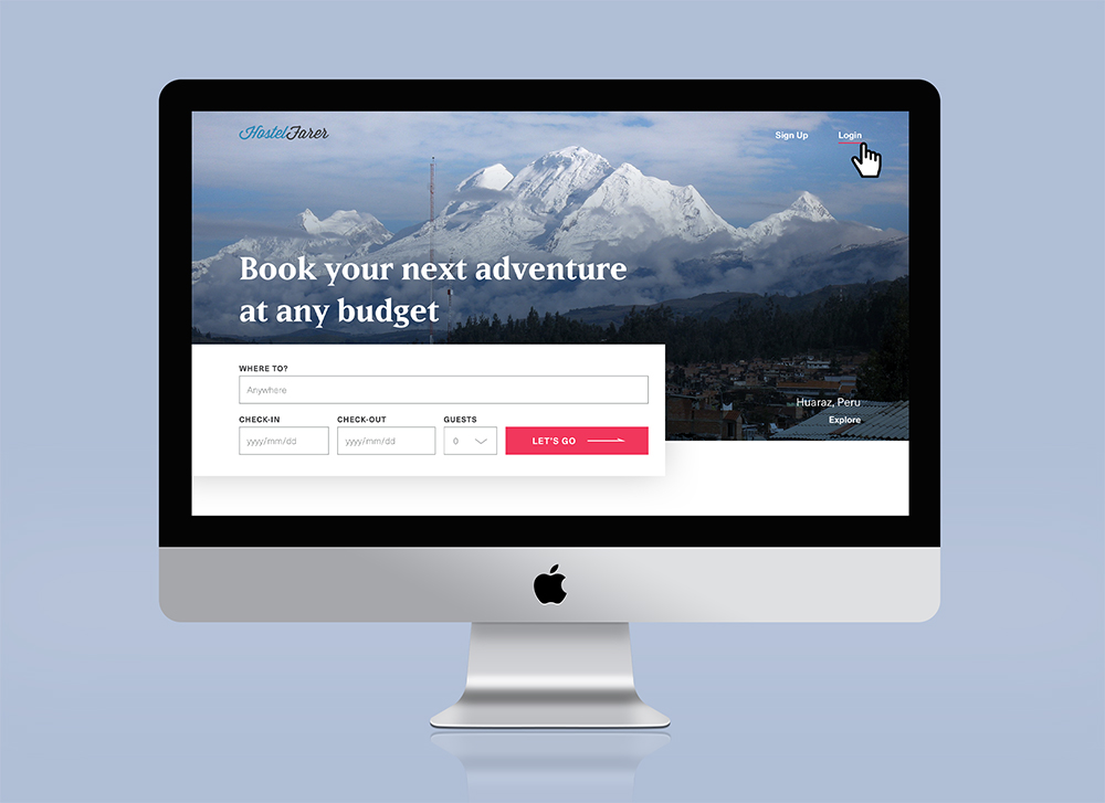
Website design for booking hostelsUI, design system

A Year of SoloPhotography, writing, book design

Self: A Portrait Through FilmData visualization

The JabberwockyIllustration

The Queen is DeadIllustration

A Food Blogger's Year in ReviewData visualization

MoistGraphic design

CabaretIllustration, graphic design
